Product Design · Complex Workflows · AI
Hi, I’m Susanne, a product designer who thinks in systems. I design complex workflows and AI-powered products, with a focus on what happens when systems act on their own, decisions need oversight, or things don’t go as planned.
Designing human oversight into an AI security workflow.
Arclight/Solace · Agentic SOC · System Design
Software is often designed to hide uncertainty. That's dangerous when analysts are overwhelmed by alerts.
Arclight is an AI-powered security operations platform exploring what happens when AI takes on more of the investigation without taking away human judgment.
Solace is the intelligence layer within Arclight, orchestrating specialist agents to investigate threats and show what the system knows, where it is uncertain, and why it reached a recommendation. The analyst decides what happens next.
Selected work
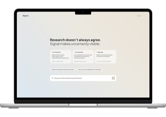
When evidence conflicts, uncertainty is part of the interface.
Signal · AI Research Agent · Product Design
Research tools are built to look confident. That's a problem when the output is driving real product decisions. Signal is an AI research system that shows conflicting evidence and knows when it can’t support a defensible conclusion.
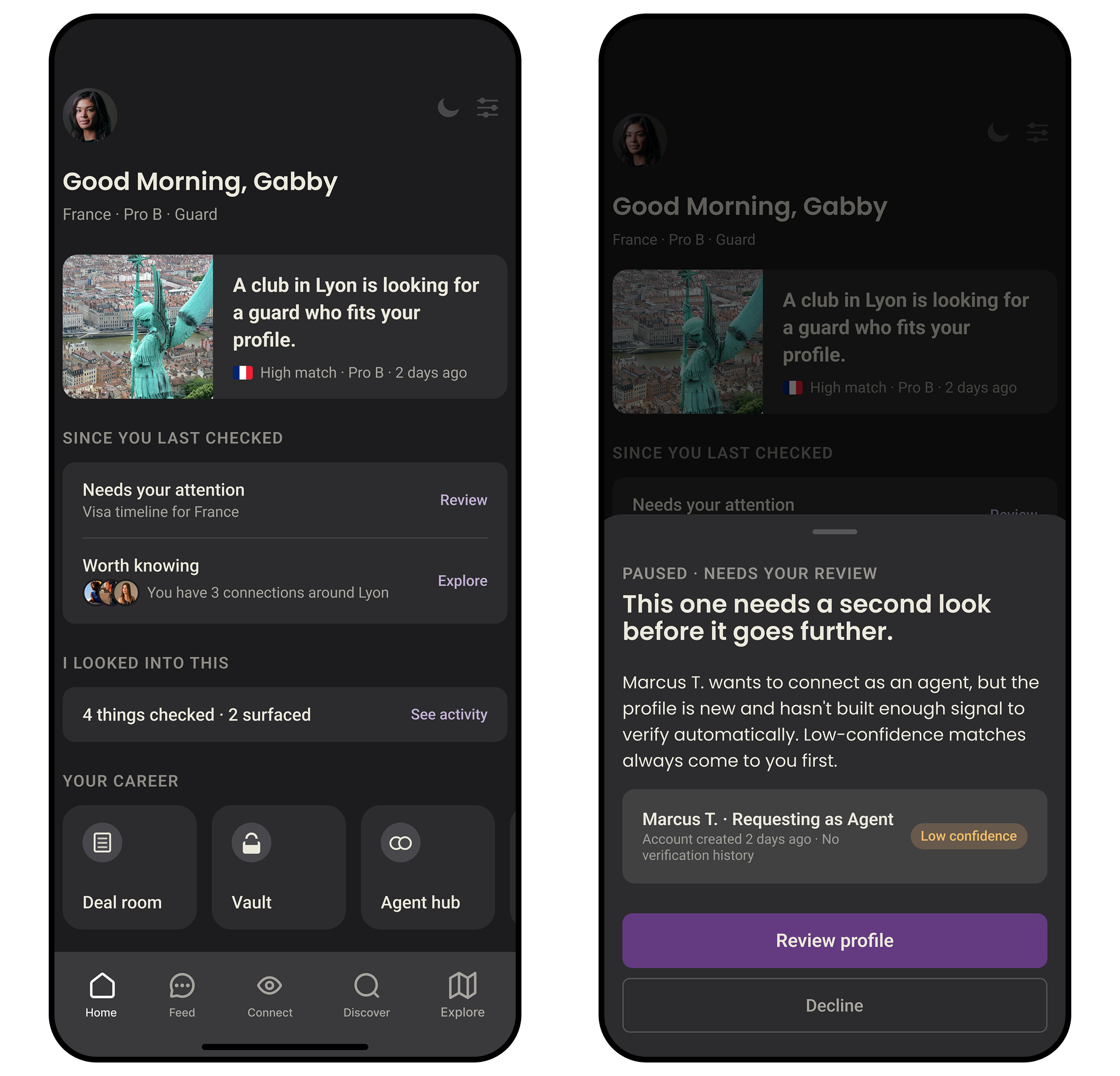
The right connection matters more than having more connections.
WEVOLV · UX Research · Athlete Network · Product Design
Athletes already know how to network. What they don't have is a way to know who's worth approaching before they reach out. I designed the trust and context layer that answers that.
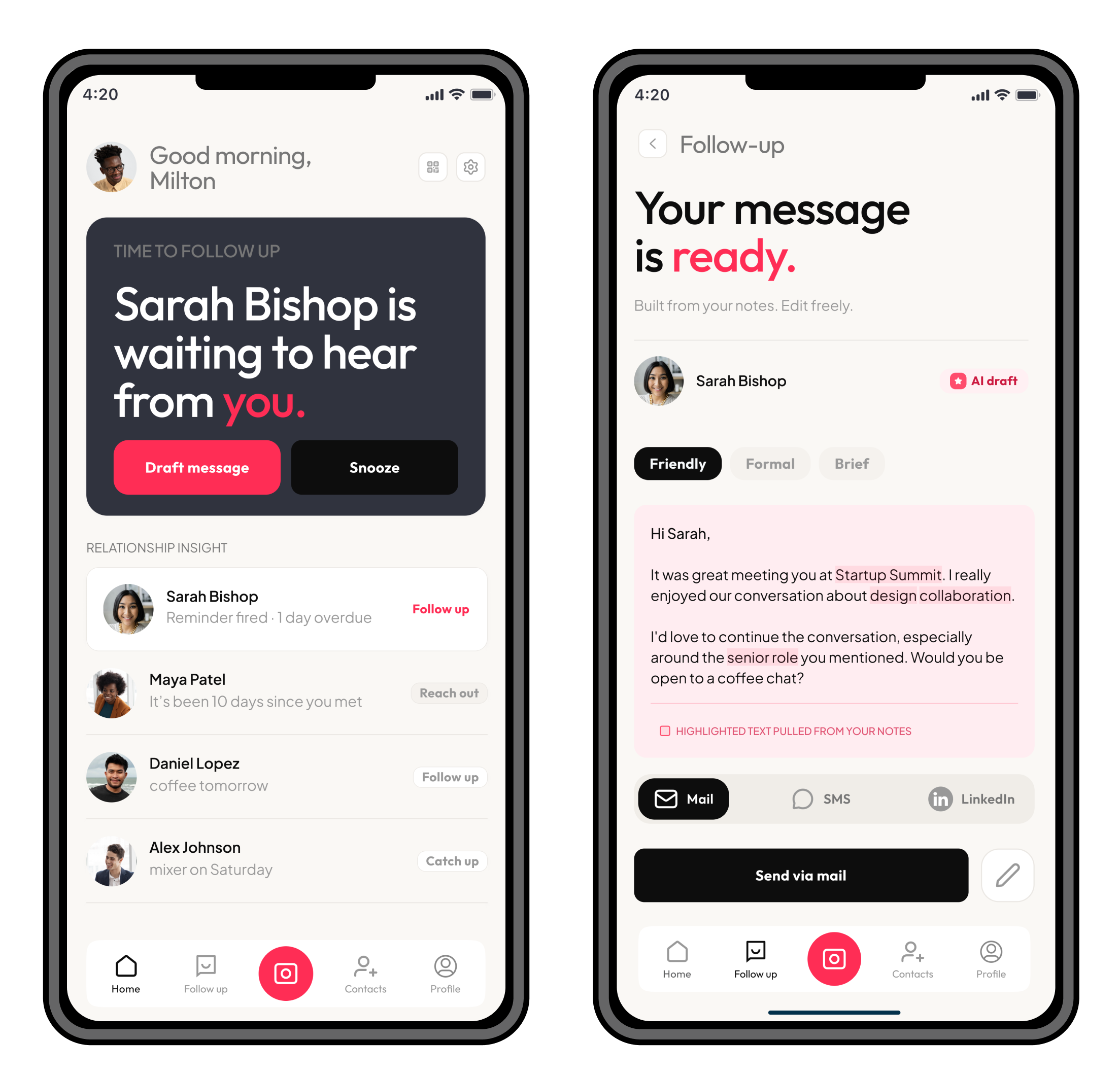
Connections are made easily, but rarely followed up.
HeyFollowUp · UX Research · Product Design
Most networking tools are good at saving contacts. They're bad at what comes next. I redesigned the follow-up experience around the moments where people lose momentum because a connection you never follow up on isn't really a connection.