The handshake is well supported. The follow-up less so.
HeyFollowUp · UX Research · UX Design
People leave events with new contacts and good intentions. The follow-up window is short and often nothing happens after the initial connection.
I looked at where users were dropping off in this transition and redesigned key parts of the experience:
Capturing a connection while context is still fresh
Organizing contacts by relevance and priority
Supporting follow-up messages with structured AI assistance
Duration
9 Weeks
Team
Collaborated on stakeholder interviews; research synthesis, design, and prototyping led independently
Tools
Figma, Miro, Google Docs
The message stage is where follow-up stalls.
You leave an event with new contacts, sometimes dozens. Names go into your phone, cards get saved and there’s an intention to follow up. A few days pass, the context fades and when it’s time to write a message, it often doesn’t come together.
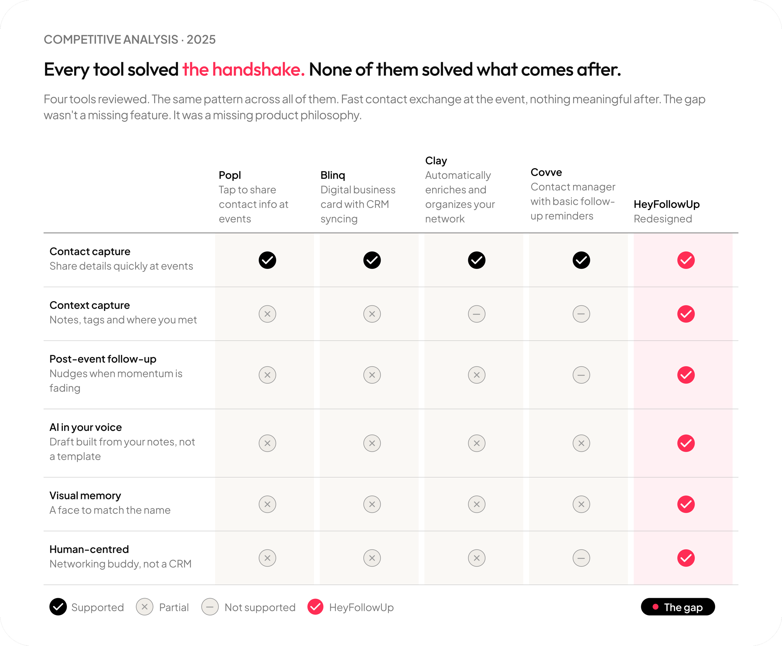
Problem Not all networking tools support what happens after a connection is made. Many are built around structured contact management, often feeling closer to a CRM than a simple follow-up tool.
Follow-up, in practice, needs to be lightweight and easy to return to not something that adds more process or complexity.
Gap After a connection is made, context fades quickly and there is little support for continuing the conversation.
Most tools don’t bridge the step between meeting someone and writing a follow-up message.
Design challenge Reduce the distance between meeting someone and sending a follow-up message.
Most tools stop at the connection. The follow-up is on you.
What existsMost networking tools focus on exchanging contact information. Some extend into contact management, but often around structured or CRM-style workflows.
What that revealed Capturing contacts at events is not the difficult part. The challenge comes afterwards, deciding who to follow up with, when to do it and what to say.
Most tools focus on storing or organizing contacts, but don’t support that moment of action. Information gets saved, but it’s not always clear how to turn it into a message or a next step.
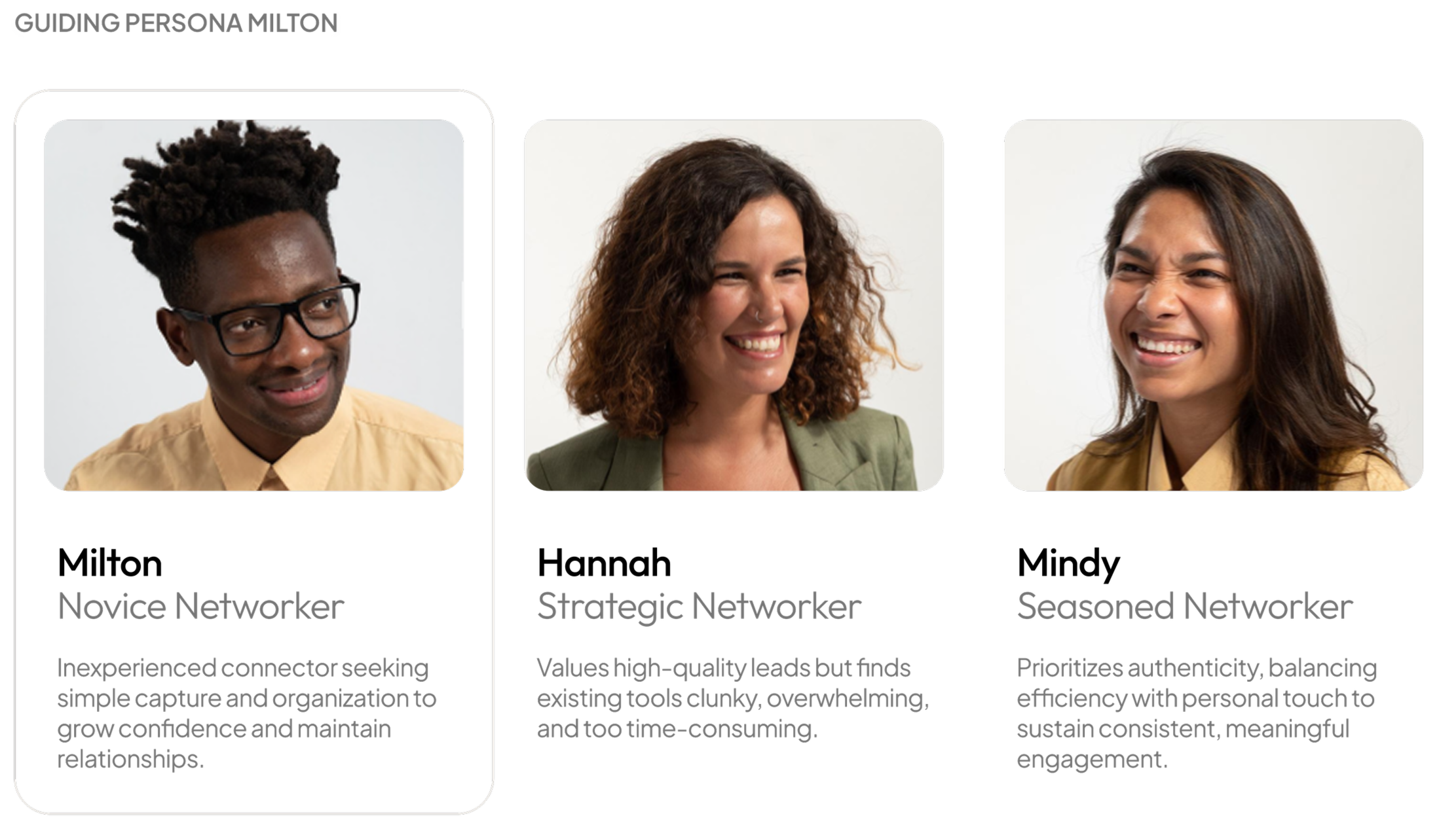
Three different networkers. The same two breakdown moments.
Milton, Hannah, and Mindy had different networking styles and levels of experience. Across them, the research pointed to the same two points where things consistently broke down.
After the event There was no clear way to capture context before it faded.
Follow-up The message stage often stalled, with users unsure what to say or how to begin.
These two moments became the focus of the design work and shaped the rest of the experience.
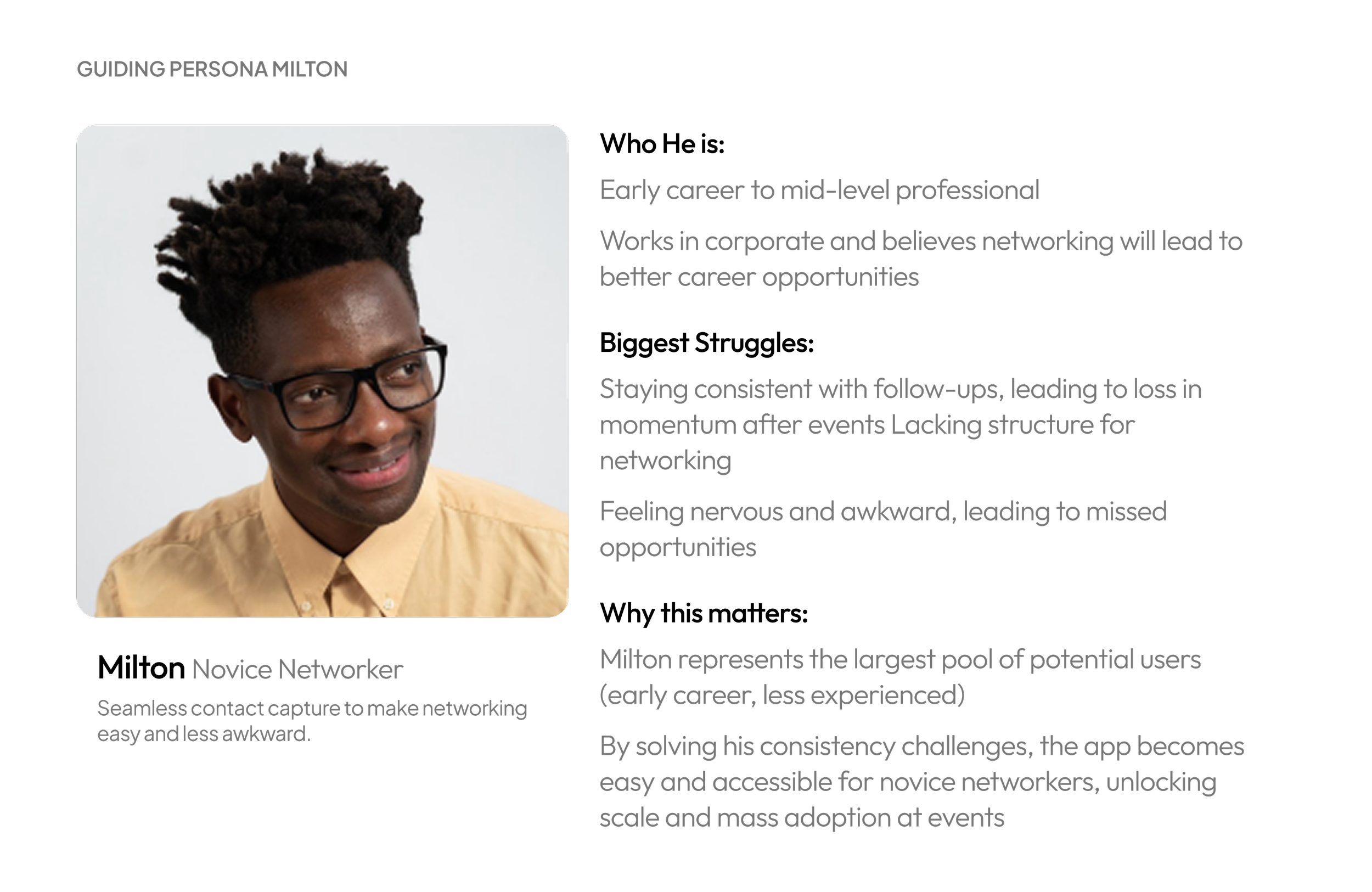
Milton isn’t new to networking, but follow-up is where his confidence disappears.
“I don't think I have a pattern... it's a very disorganized way of reaching out to people.”
- Research participant
He leaves the event with three new contacts. He meant to follow up that night. He didn't.
A few days later he opens LinkedIn. Kate just started a new position. He remembers they talked about it but it's been almost a week and now it feels awkward to reach out.
He closes the app without sending anything.
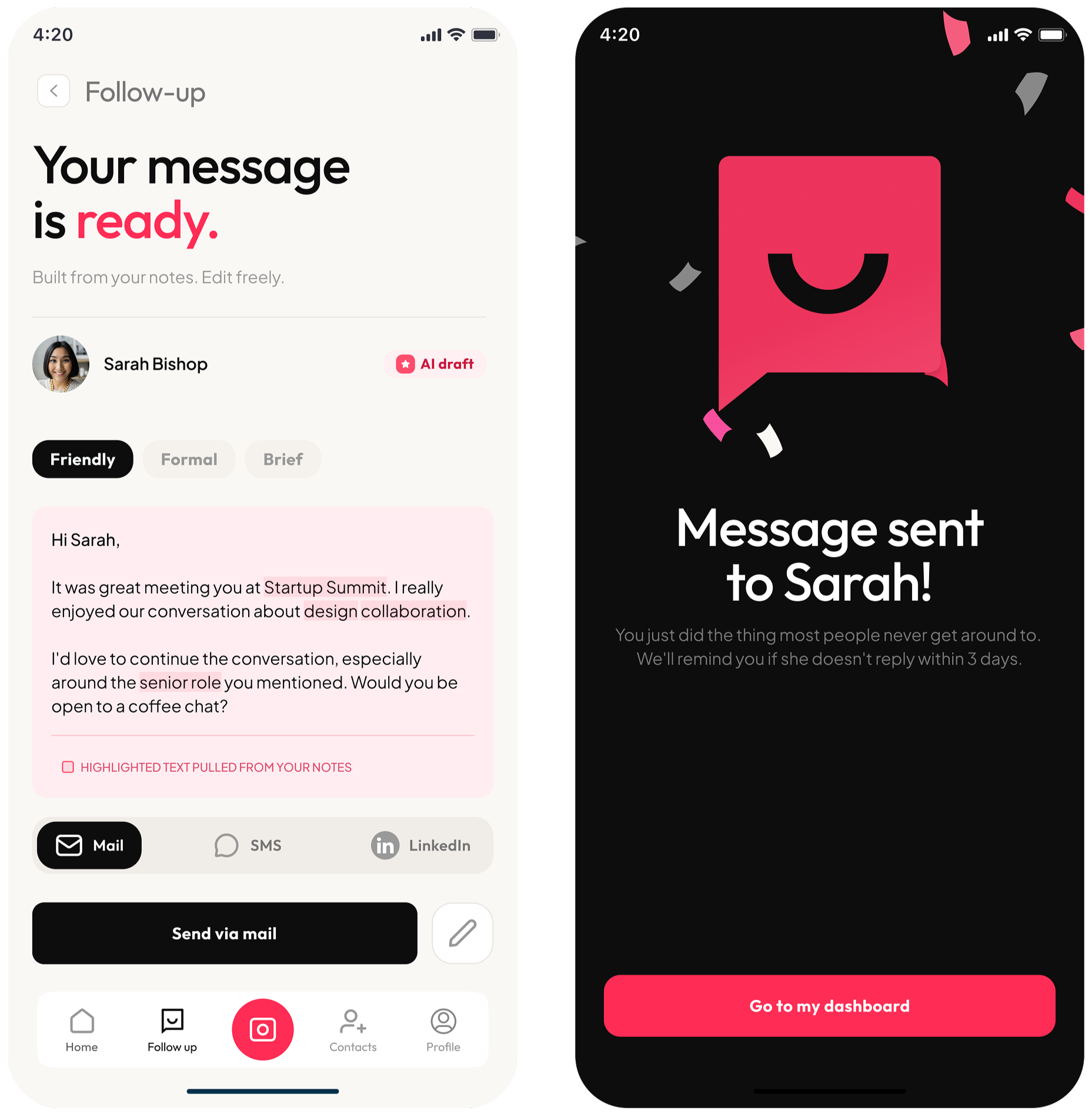
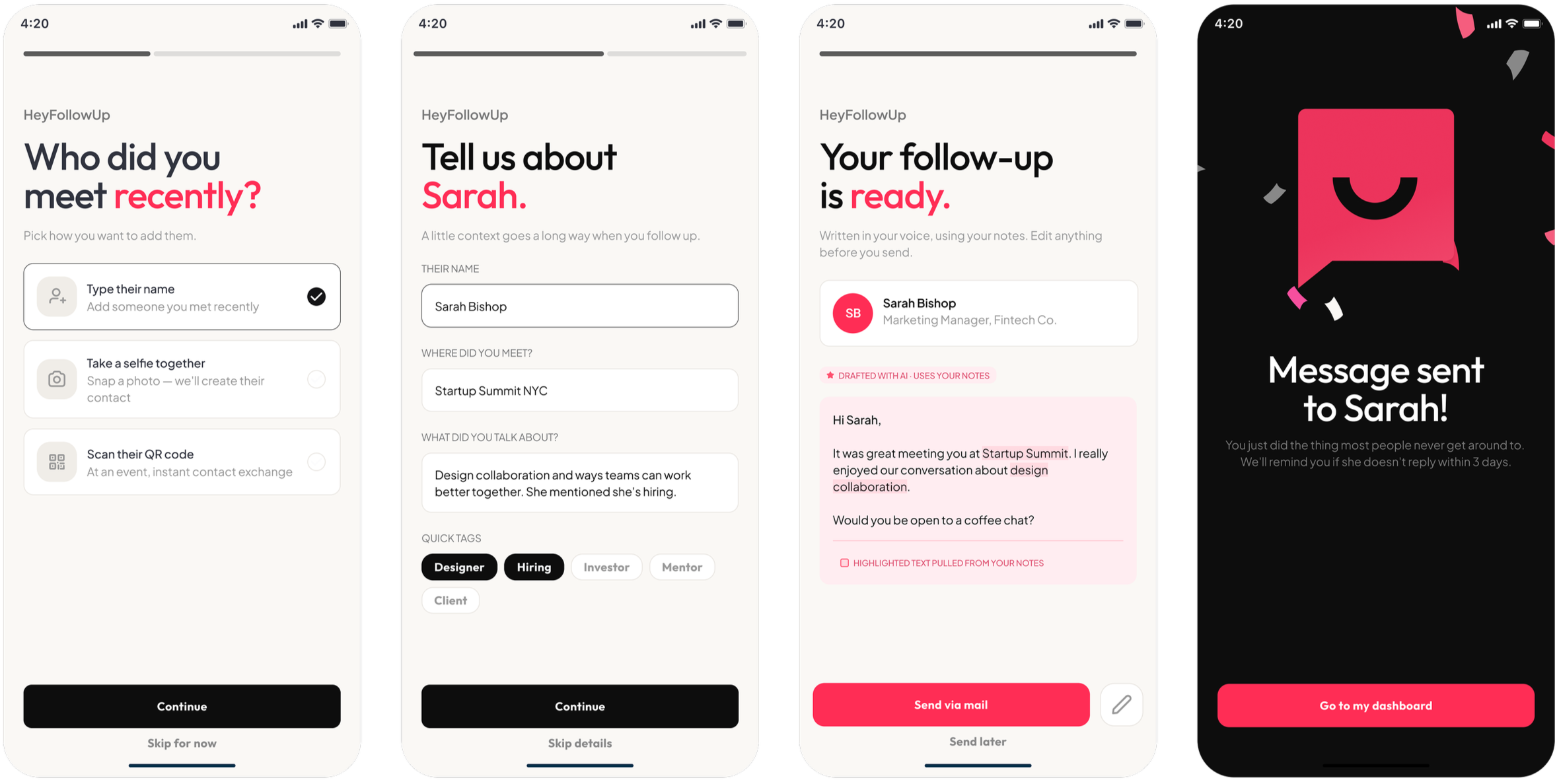
HeyFollowUp surfaces Kate the morning after the event with the notes Milton captured when they met. The draft is already started, not written for him, just enough structure that he isn't starting from nothing. He edits two lines and sends it in four minutes.
The window stays open. The follow-up happens.
That's the moment the redesign was built for.
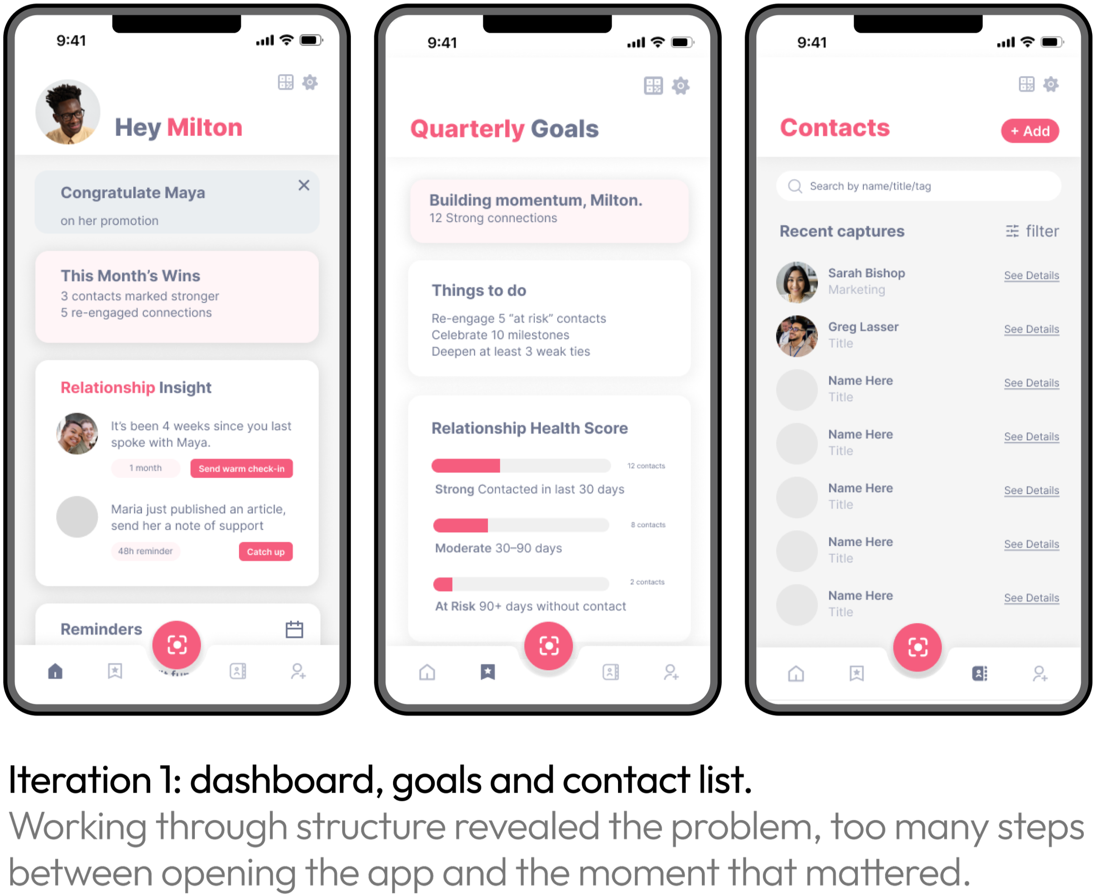
A contact list wasn't the problem.
The distance between opening the app and sending a message was.
Early wireframes used a structured contact list, searchable and filterable by relationship type and time.
The issue wasn’t the list itself, it was the distance between intention and action.
To follow up, users had to open the app, find a contact, recall context, and start writing, five steps before a single word.
This is where drop-off occurred.
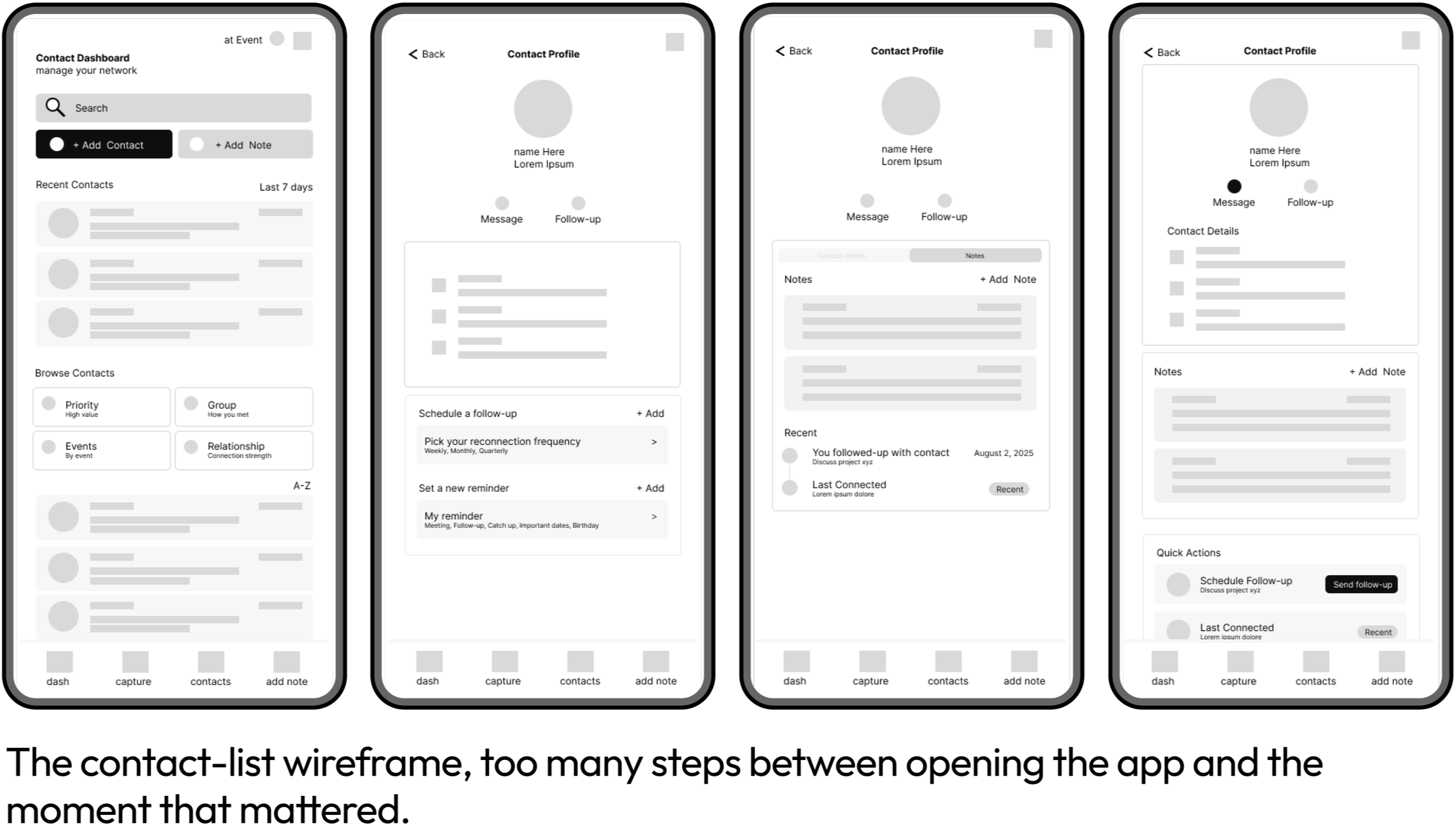
The design question was simple.
How do you get from intention to message in fewer steps?
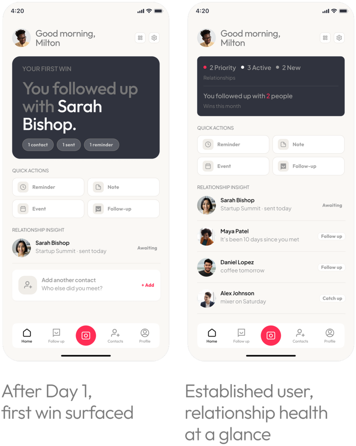
The pivot
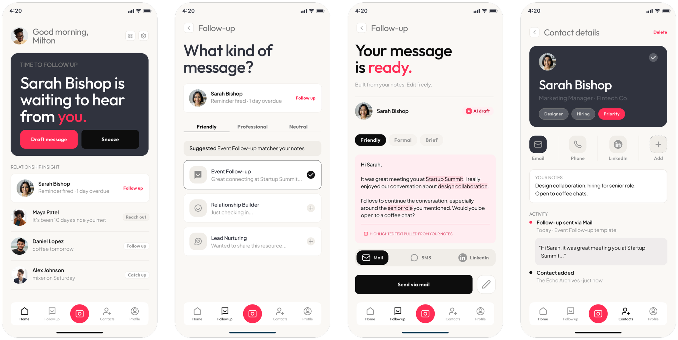
The experience shifted from a contact-first model to a dashboard-first flow. Instead of managing a list, users are shown relevant contacts based on relationship status and recency of interaction.
The focus is on surfacing the next likely action rather than requiring users to search for it.
Design principle
Does this reduce the distance between intention and sending a message?
Key changes
Quick actions surfaced directly within the main dashboard
AI draft available from reminders without additional navigation
Message suggestions introduced at the moment of contact capture, not only at follow-up
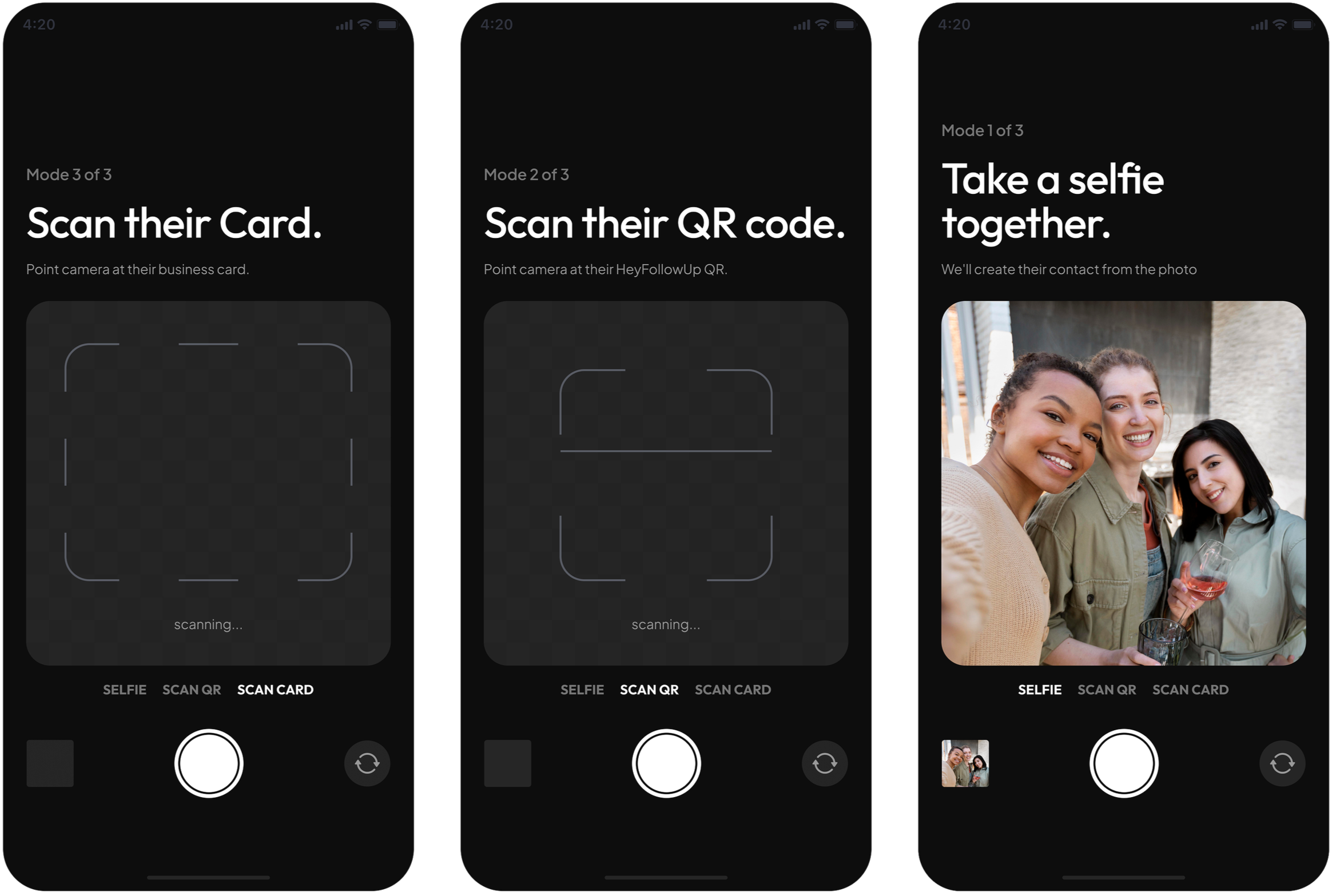
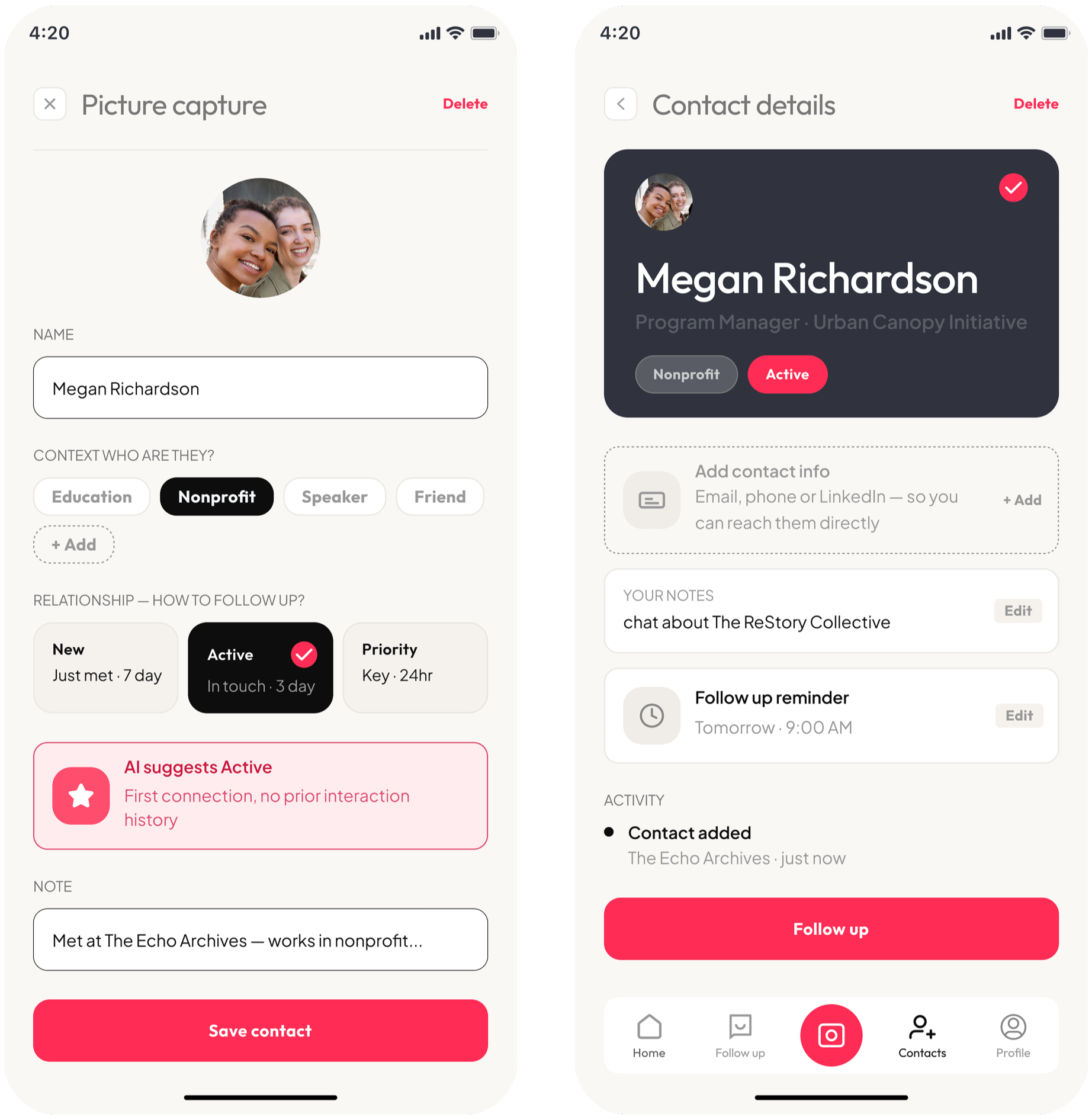
Capturing a contact mid-conversation is its own kind of friction.
HeyFollowUp reduces that interruption by offering different capture options depending on the situation.
Selfie
A quick way to attach a face to a name.
QR scan
Instant contact exchange.
Business card scan
Capture details before they get lost.
Each option takes under thirty seconds. All entries are stored in one place, with notes, context tags, and a follow-up reminder already set.
Users wanted help starting the message.
They just didn’t want it to sound like it came from someone else.
The hardest part of follow-up isn’t intent. It’s starting.
HeyFollowUp surfaces the right contact and drafts a message from the user’s notes. The AI handles structure; the user keeps the voice.
Comfort with AI assistance came down to one thing.
Did it still sound like them?
I tested the experience with 7 users across two key moments: post-event organization and assisted follow-up.
Drafts were accepted when they were based on the user’s own notes and context. Email and SMS integration reduced the need to switch between tools. Reminders, notes, and tags helped keep connections active.
Users weren't resistant to AI help. They were sensitive to whether it still sounded like them. The concern wasn't using the system. It was losing ownership of how they communicate.
The follow-up happens when starting feels easier than not starting.