Research doesn’t always lead to one answer.
Signal · AI Research Agent · Product Design
Research rarely agrees cleanly. Signal keeps those conflicts visible instead of resolving them into a single conclusion.
Signal is an AI research agent that keeps conflicting evidence visible and treats synthesis as a working interpretation that can be challenged, not finalized.
Built for design teams who need to move fast without losing the reasoning behind their decisions.
Duration
4-week sprint
Role
Self-directed · solo design & prototype
Tools
Figma · Claude Code · FigJam
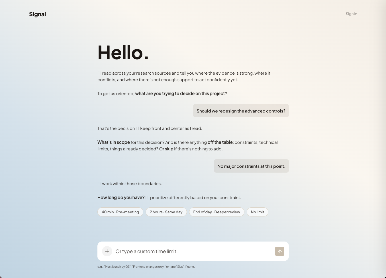
Signal doesn’t start with a form. It asks you a question first.
Designers already use AI to synthesize research. The problem is you can't see how it got there, the contradictions it resolved, the leaps it made or the evidence it weighted. Signal shows its work. Every step of the synthesis is visible, interrogatable and yours to push back on.
Signal asks two things before it reads anything: what are you trying to decide and how much time do you have? The synthesis is fast either way. What changes is how much time you get to push back, to question a finding, correct a source or work through a conflict before you have to act on it. It also needs to know where the brief is going. A PM meeting needs different things from the same research than a peer review does. The opening questions aren't onboarding. They're calibration.
Wireframes
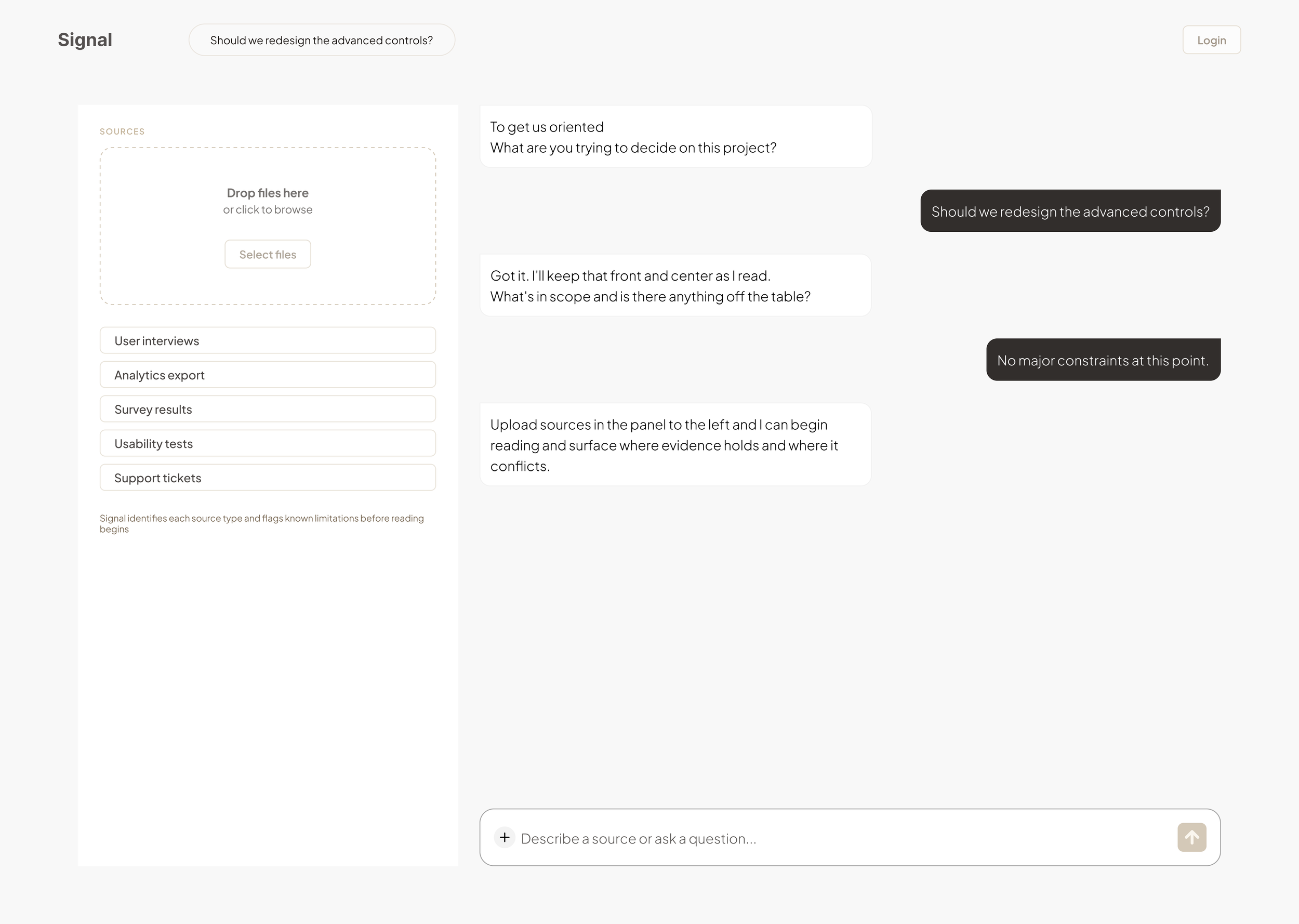
Left drawer + source list
Two surfaces competing. Sources managed separately from the conversation. Abandoned when it became clear chat needed to be the only surface.
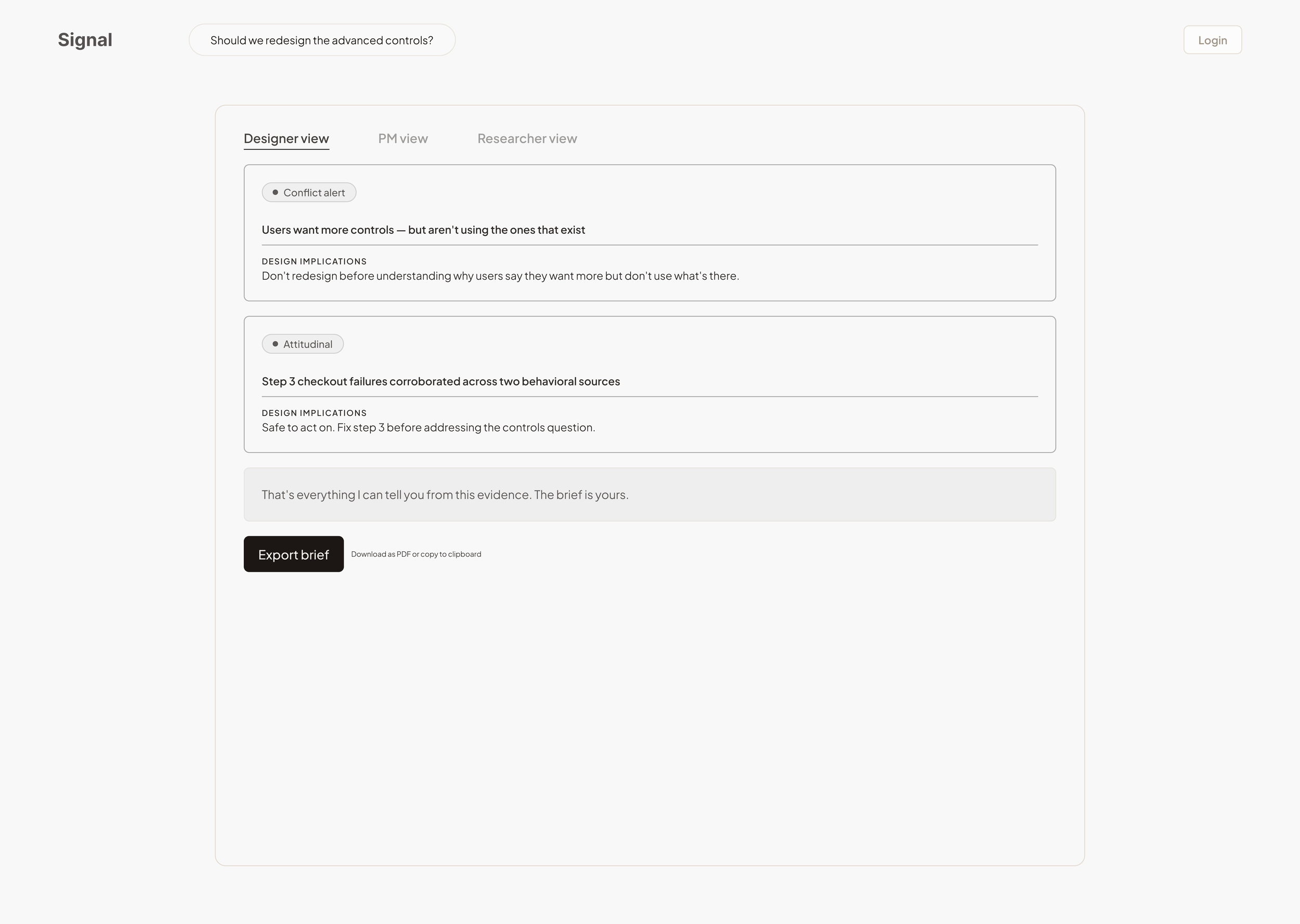
Static brief, export and done
Signal produced findings and went quiet. No way to question a finding or correct an inference. The only action was to export.
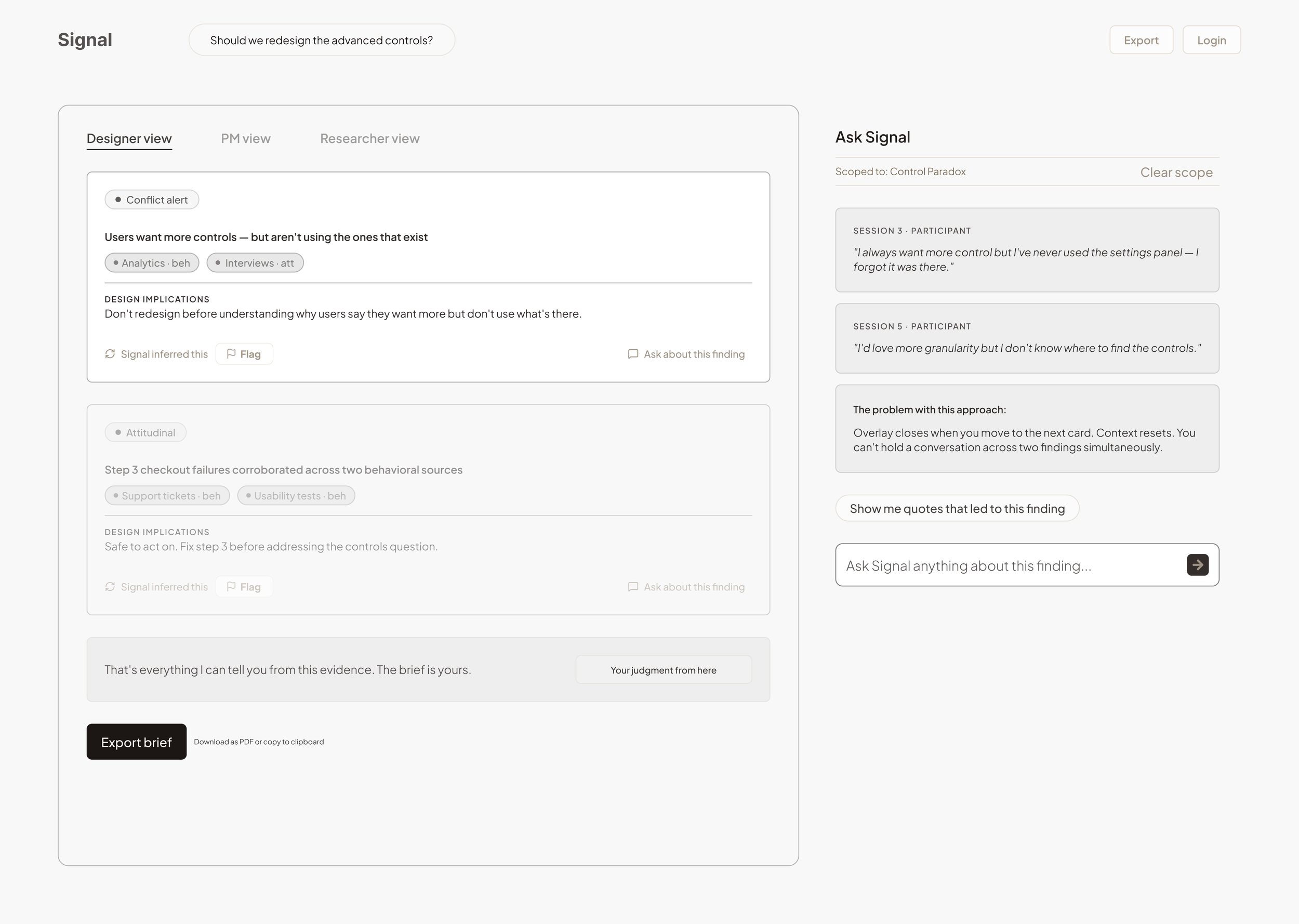
“Ask about this finding” side panel
Evidence retrieval worked: quotes, reasoning, source data all surfaced. But the panel closed every time you moved to another card. Context reset with every question. The container was wrong.
Signal diagram flow
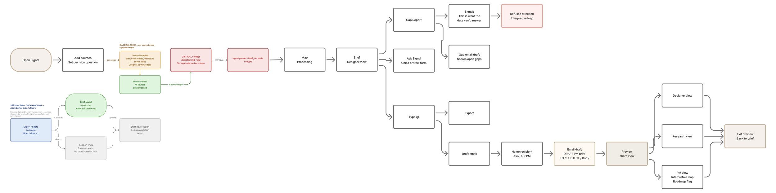
How evidence becomes a decision
Evidence doesn't arrive as a conclusion. It moves through four states before Signal will stand behind it and the transitions matter as much as the states.
Stage 1: Setup
The decision question comes before the sources. Knowing what you're deciding shapes how it reads the evidence. The judgment is still yours.
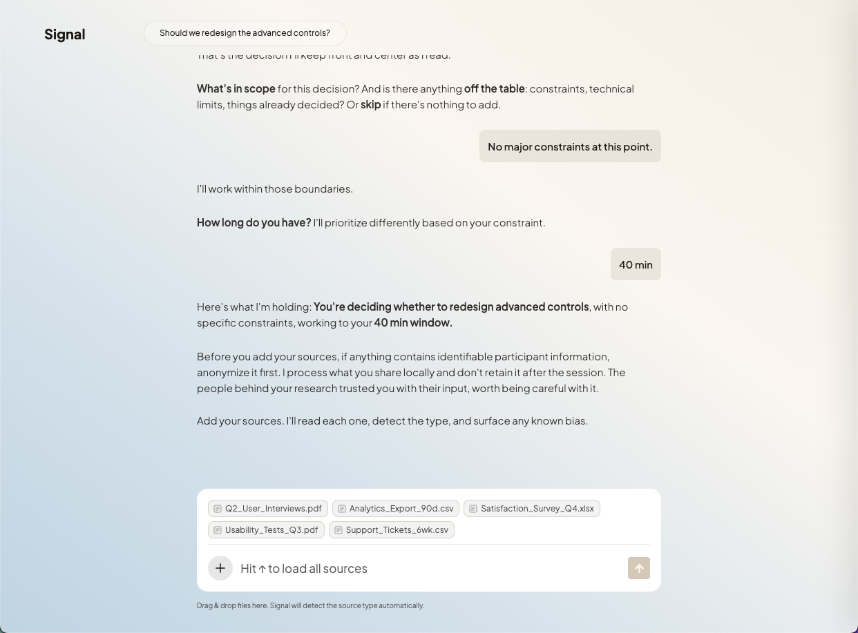
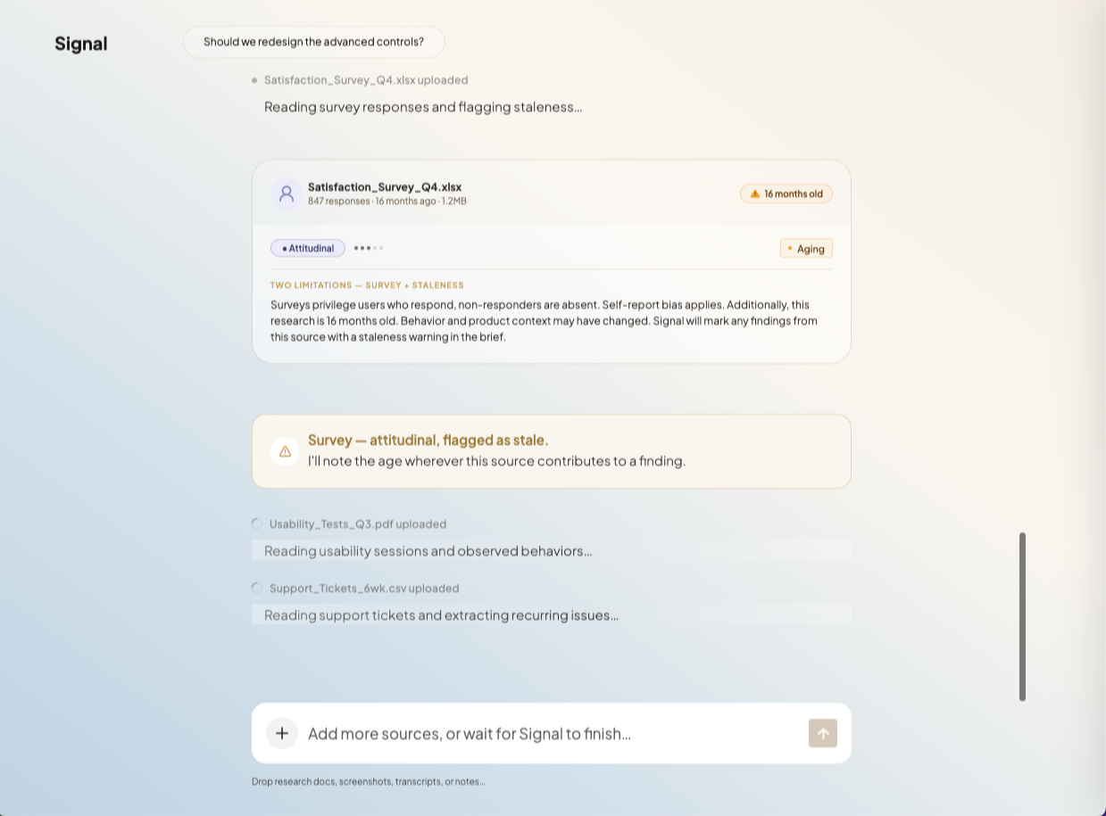
Stage 2: Ingestion
Signal shows its work as it reads: per-source status, early patterns and conflicts as they emerge. If something looks wrong, you can stop it before analysis continues.
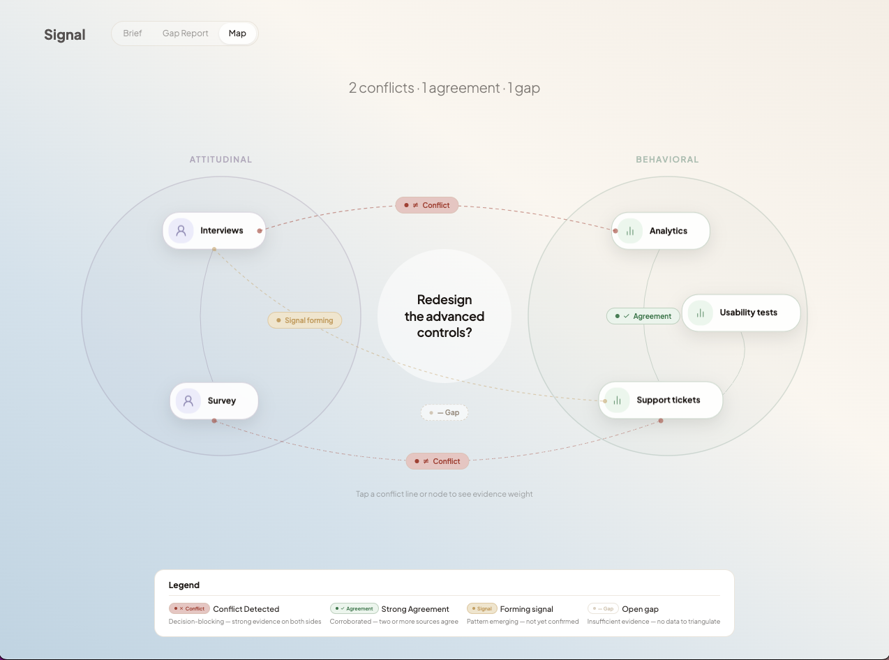
Stage 3: Triangulation
Signal cross-references sources and surfaces where they disagree. Conflict is the most important thing to see before synthesis begins.
Stage 4: Handoff
Signal hands off a brief that carries its reasoning: evidence, attribution and open questions intact. Not a snapshot. A working document.
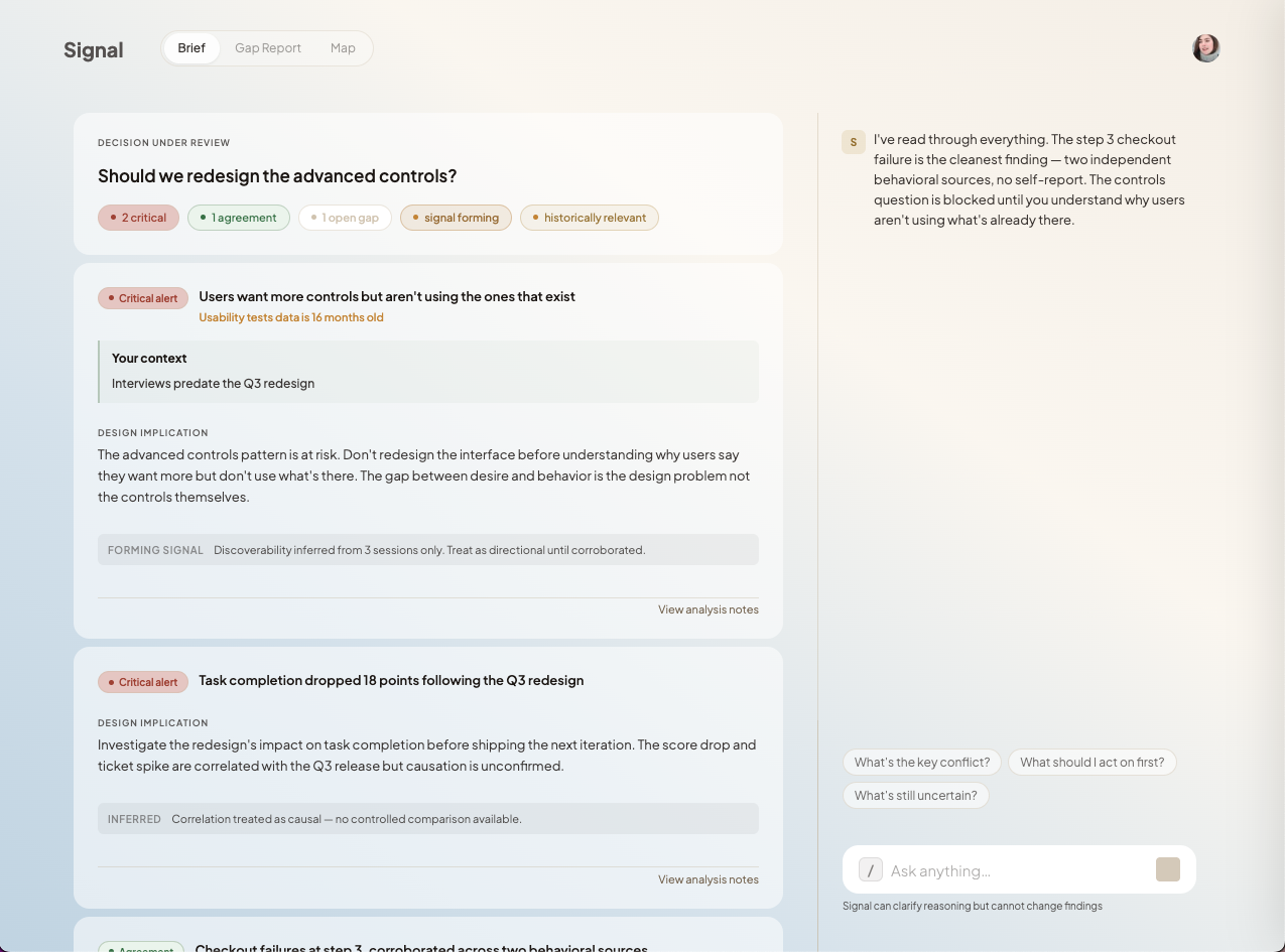
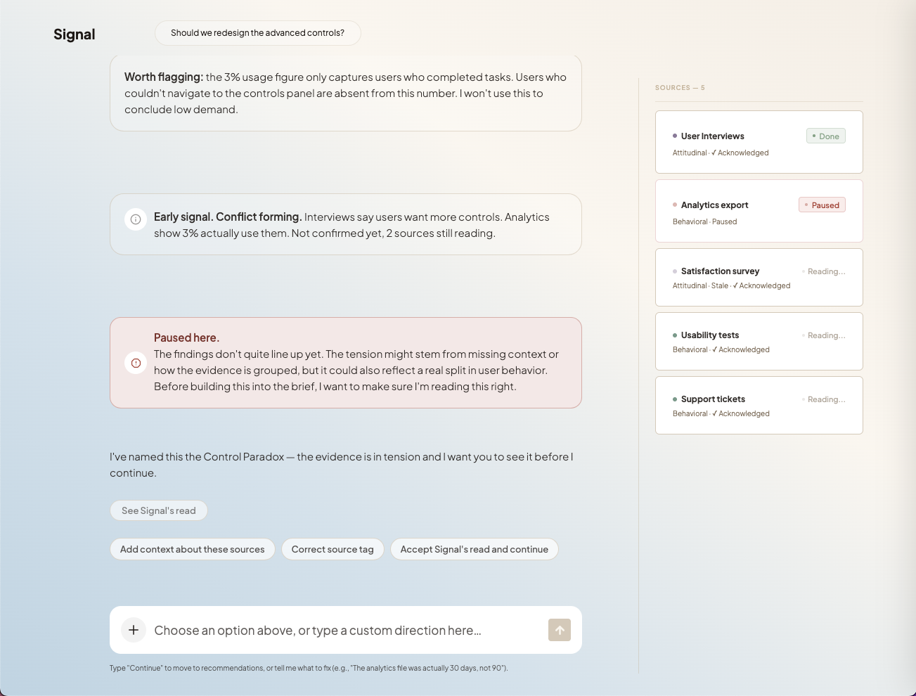
Mid-Read, Signal Stops Itself
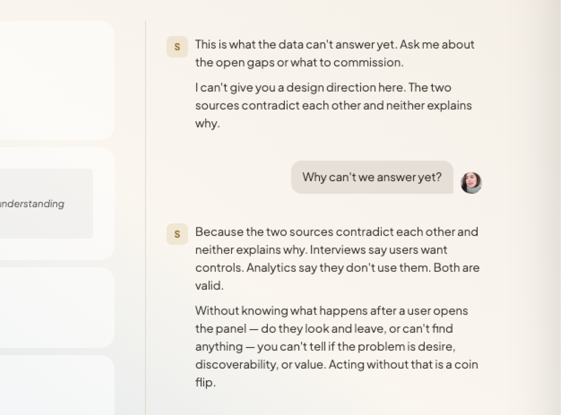
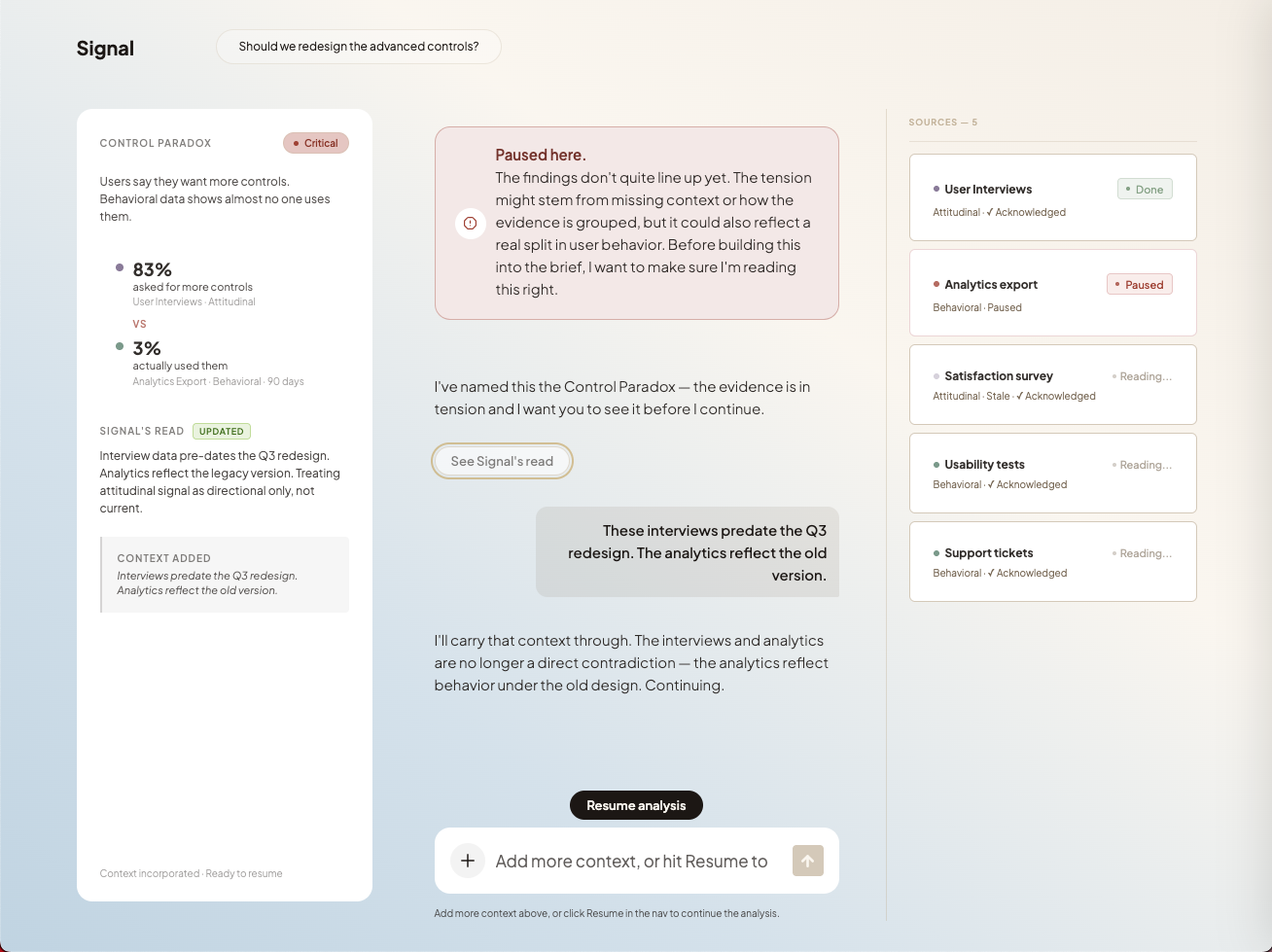
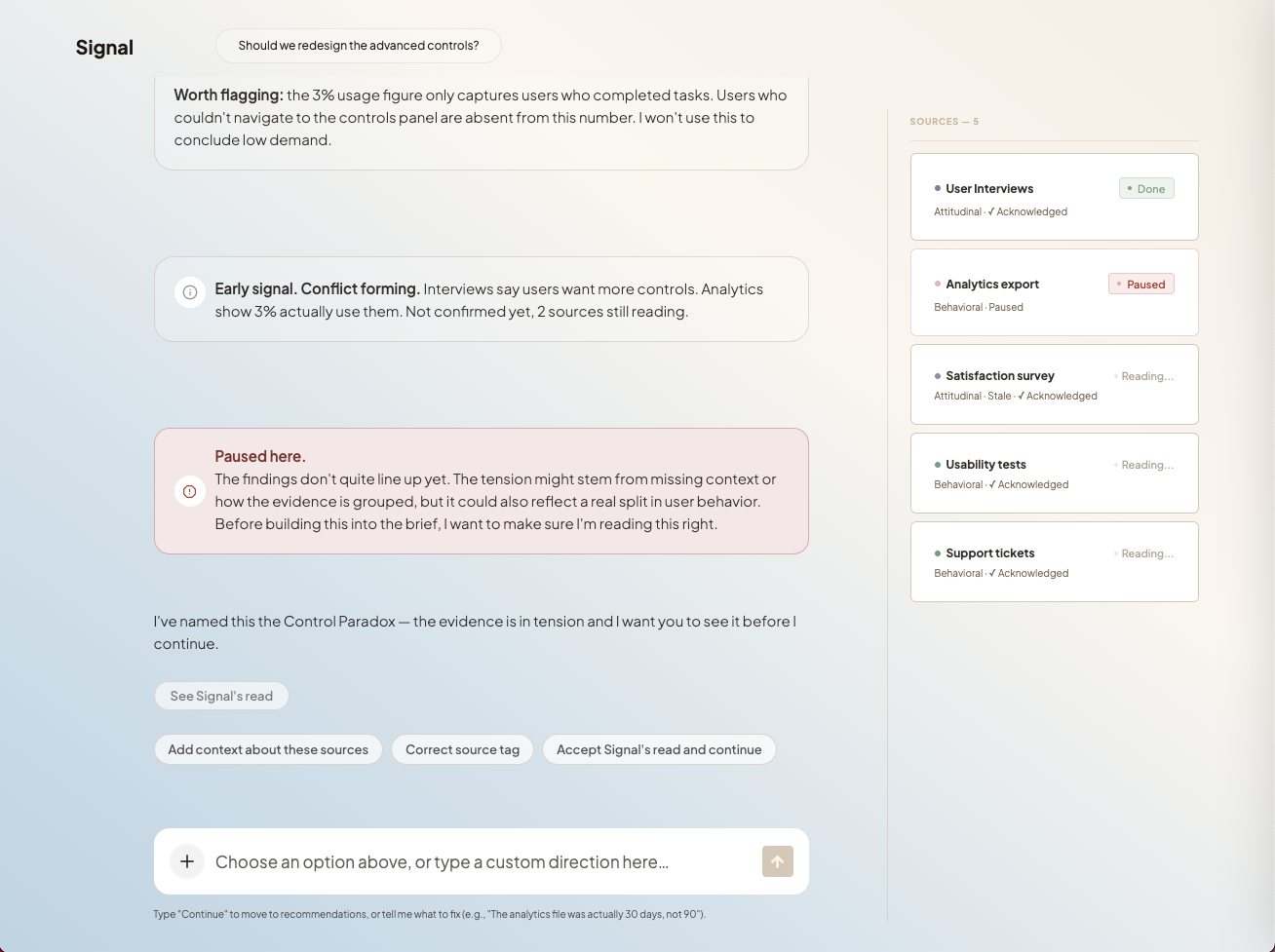
When the evidence isn't strong enough to support a conclusion, Signal stops and shows what's missing. Instead of forcing synthesis into a confident answer, the system stops at the point where the data runs out.
This pause is not a failure state. It marks the boundary of what the research can support and intentionally returns judgment to the designer who has to act on it.
The intent is to keep uncertainty visible so decisions are made from evidence, not inferred confidence.
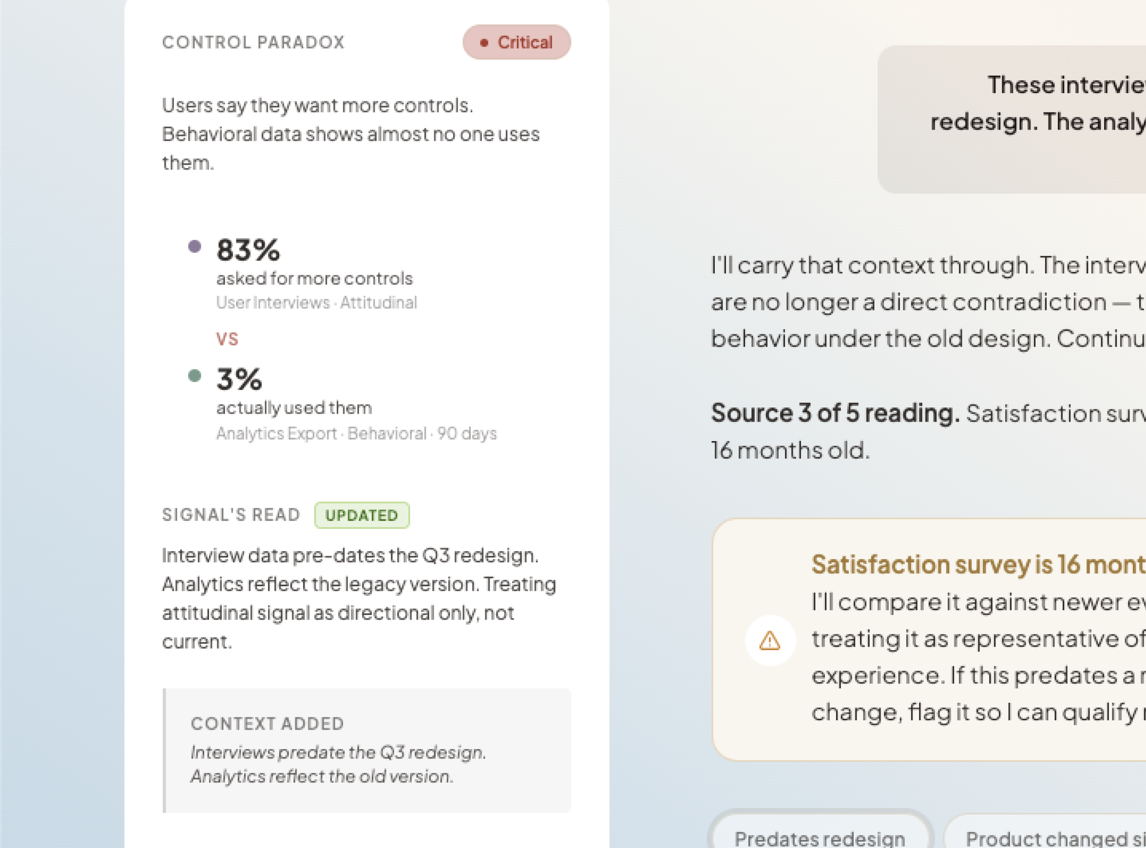
Control Paradox sidebar
CRITICAL badge, 83% asked / 3% used, source attribution on each row, three action buttons
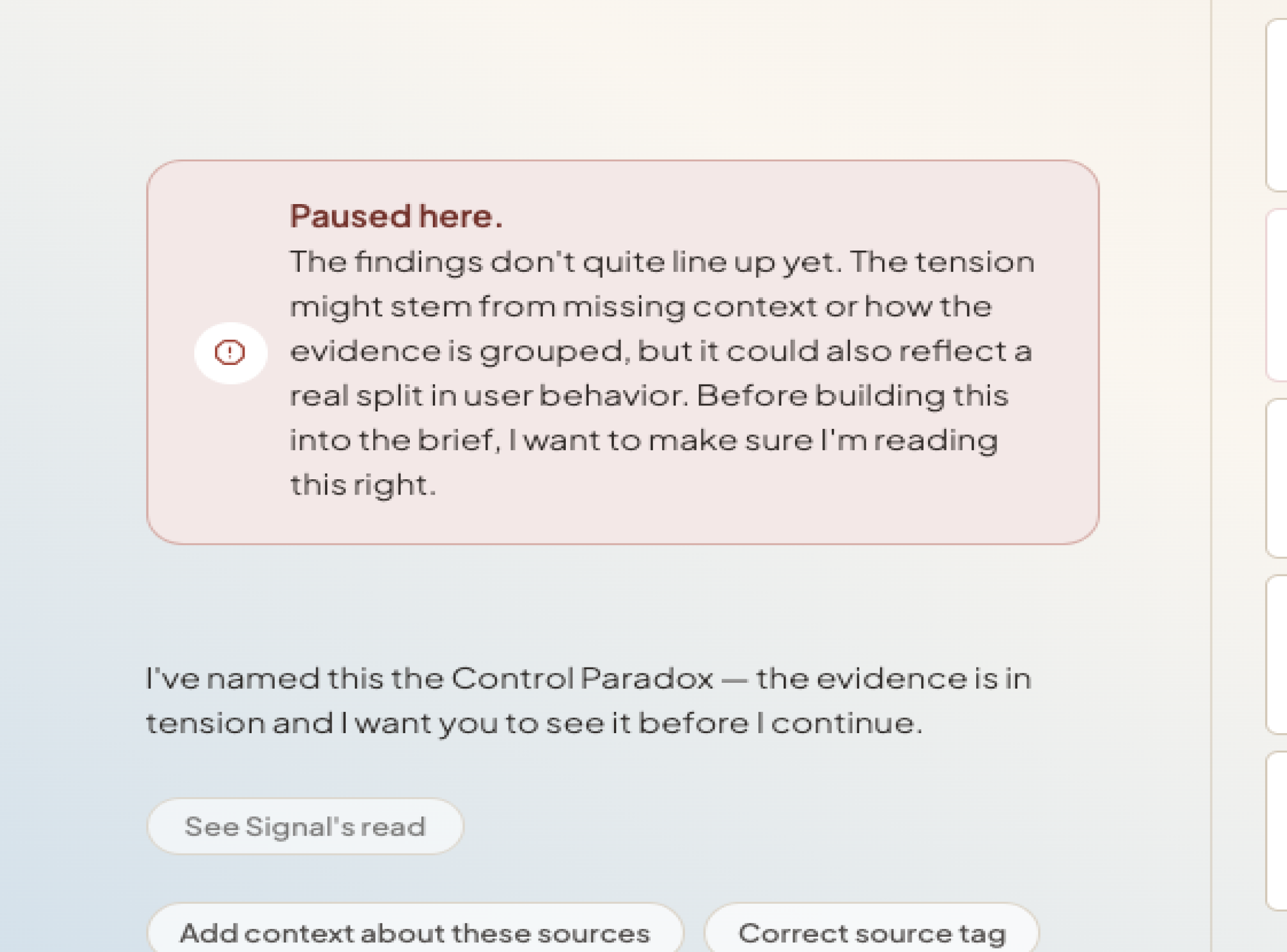
Paused here chat message
Distinct visual treatment, red tint, Signal's full narrative
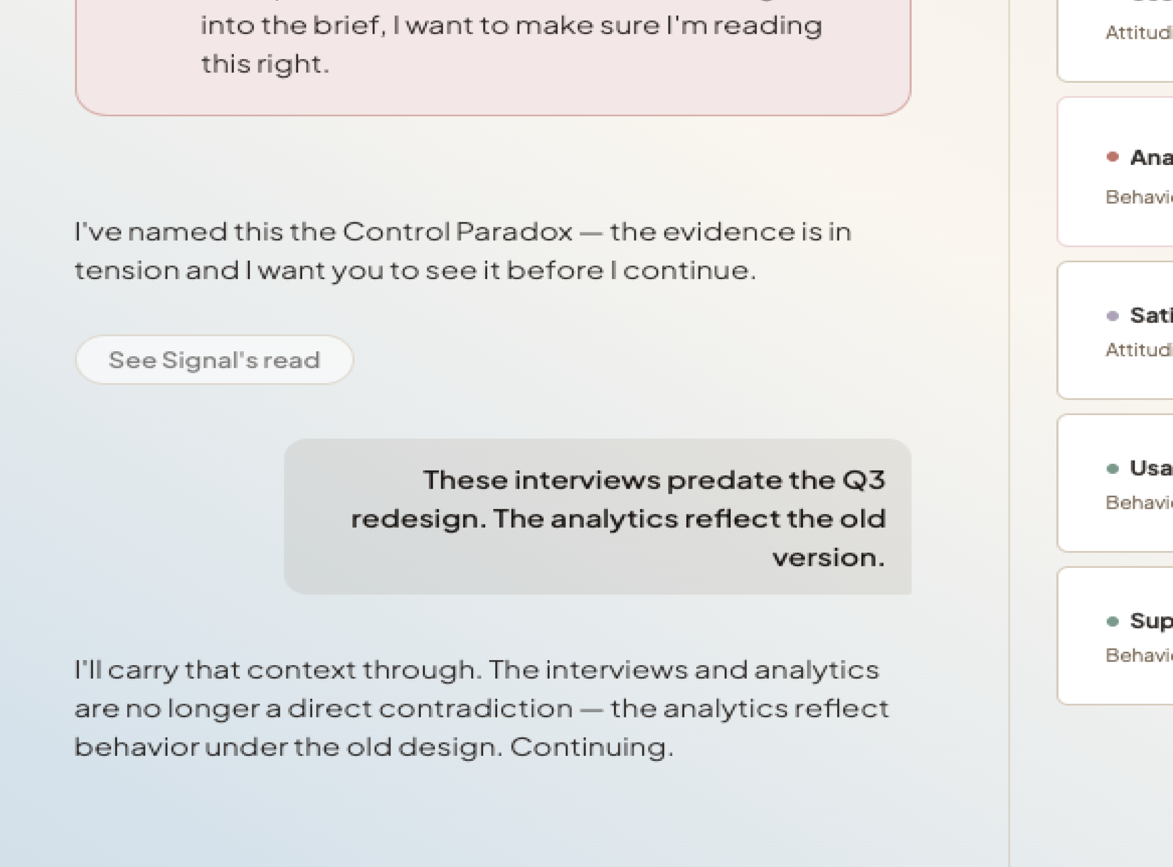
Designer's typed response
These interviews predate the Q3 redesign. The analytics reflect the old version.
Hard States as Safety Architecture
Designing for trust in an agentic system means solving four things: how it shows confidence, how it fails gracefully, how a human corrects it and how it sets expectations before it responds.
The four hard states are Signal's answer. Each one makes the reasoning visible instead of pushing through to an answer.
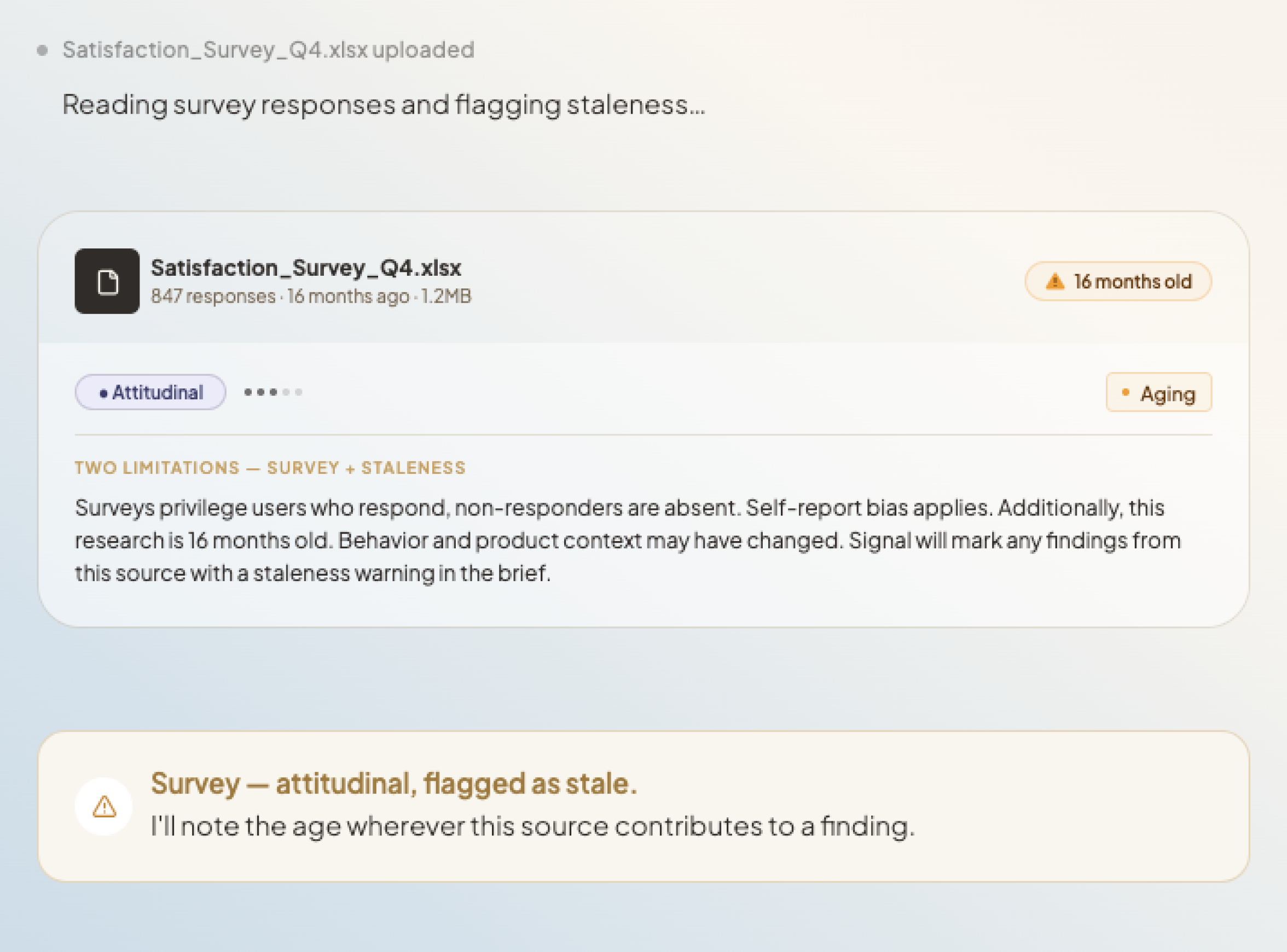
Stale Evidence
Research has a shelf life. Signal flags outdated sources before they can shape the analysis because stale evidence doesn't announce itself and it can quietly change the outcome.
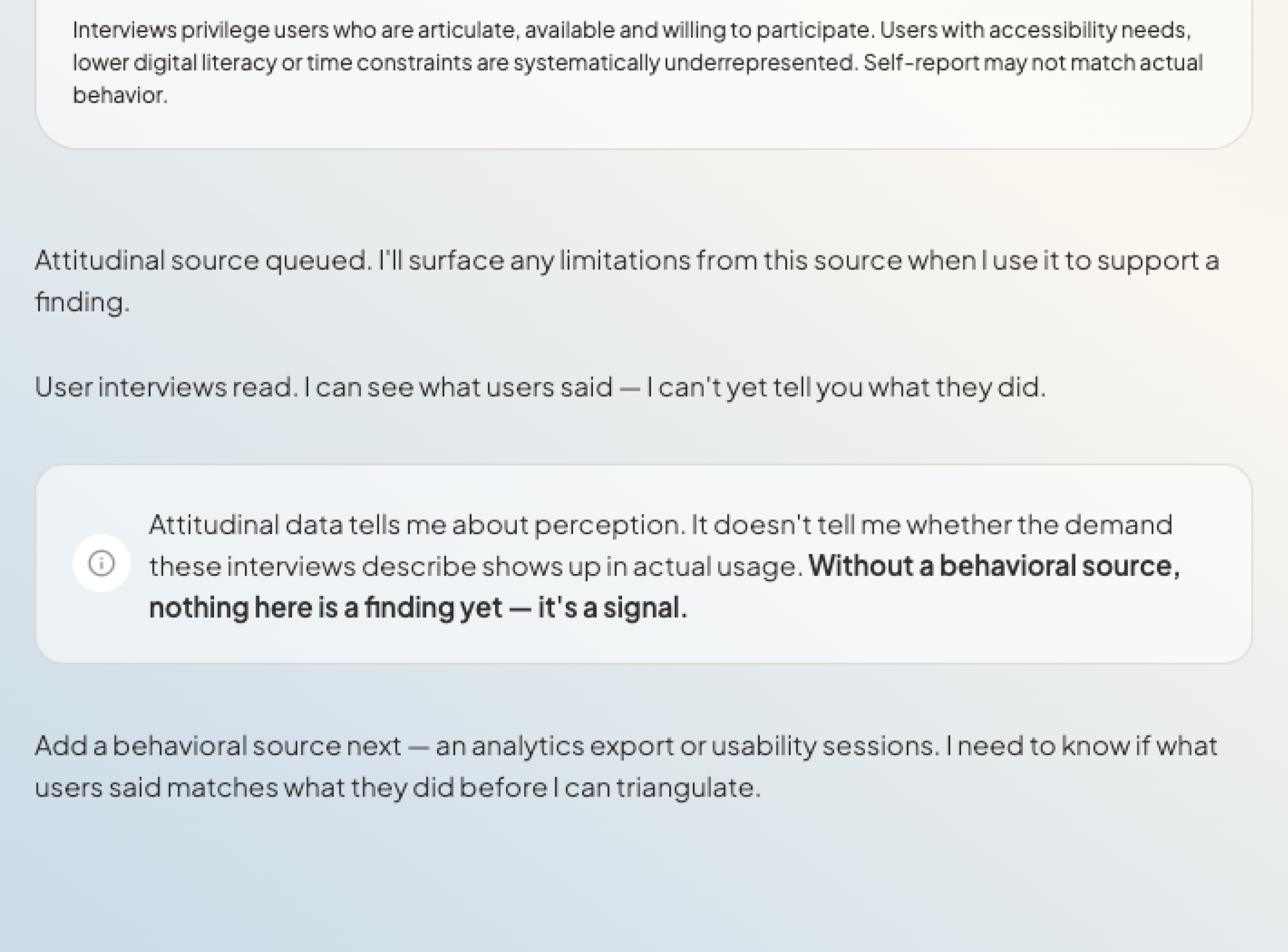
Single Source
One source can't be meaningfully compared against itself. The system flags it and identifies what additional evidence would actually close the gap.
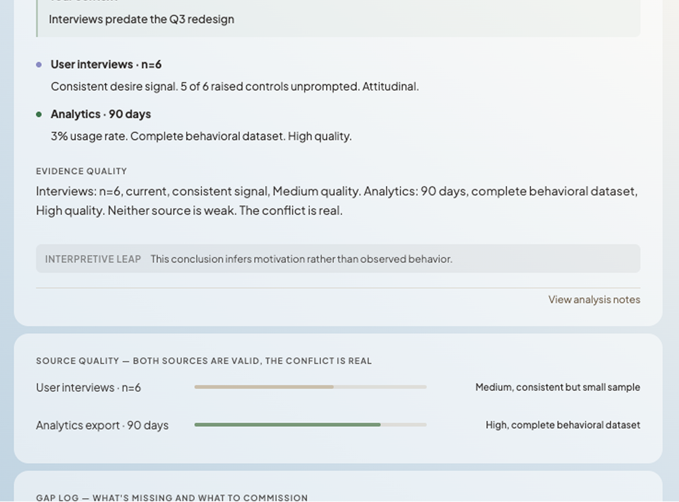
Interpretive Leap
There's a difference between what the data shows and what it suggests. Signal marks that line explicitly because acting on an inference you thought was a finding is how research leads you somewhere the evidence never actually went.
Gap Report
Some questions don't have enough evidence behind them yet. Instead of producing a brief anyway, Signal names what's missing because a confident-looking answer built on thin data is worse than no answer at all.
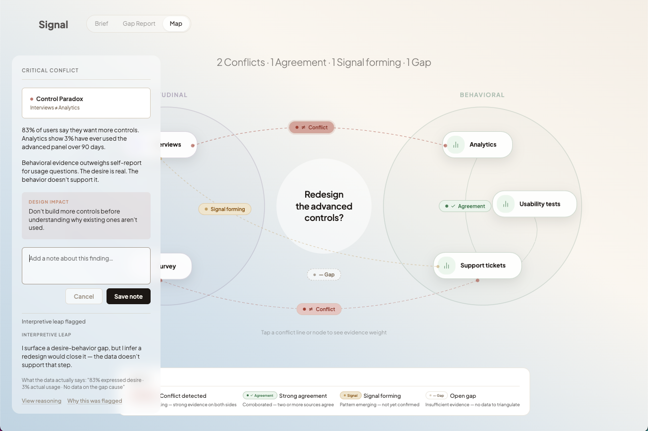
Signal shows where sources disagree so the researcher can decide how much that disagreement matters.
Triangulation is Signal's job. It cross-references sources and surfaces where they disagree. What it doesn't do is tell you why that matters, that part is yours.
Once triangulation is done, you choose how to read it. A brief reads top to bottom, the findings in sequence. The map lays the same findings out in space instead, so you can see how they connect and catch what a linear read would flatten.
Tracing the relationships means marking where findings reinforce each other, where they pull apart, and which sources sit behind each one. Annotating the map is how you record what a linear sequence would hide.
The map is optional and it costs something. A spatial view takes more effort to read than a list. It's worth that effort only when the connections it surfaces are ones a linear brief would have buried.
Push back and the reasoning changes.
When a finding is challenged, Signal revises its interpretation of the evidence rather than logging the disagreement as a separate note.
If new context is added, that interviews predate a redesign; it updates what the evidence can still support and records what changed and why.
The brief becomes something that can be actively interrogated. Its conclusions are not fixed; they shift as the underlying interpretation shifts.
Most tools give you outputs you annotate around. Signal produces outputs you can argue with.
Role-specific views
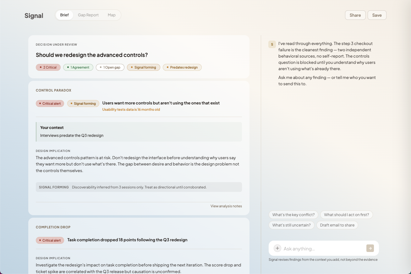
At the brief stage you choose who you're sharing with. A PM, a peer, a stakeholder, each gets a view built from the same research, framed for what they actually need. And because the brief is a live link, they can interrogate the findings themselves. The reasoning doesn't get lost in translation.
Brief tab — Finding cards, risk badges, source chips, design implications. What the designer reads before making a call.
Gap Report tab — Named gaps, what's missing, what research would close it.
Map tab — The spatial view. Optional.
Sharing your findings
A shared brief doesn't leave Signal as a static document. The live link keeps the reasoning intact so teammates can inspect findings, follow the evidence and push back as the project changes. The free version lets anyone try it. No account needed. But without one, your sources, brief and findings don't persist. An account saves your work, unlocks collaboration and keeps the brief alive across phases.
Principles, embedded in interaction
The inference badge appears directly on findings where the system reasons beyond source evidence.
Bias disclosure is surfaced inline on source cards as they enter analysis, not as a setup step.
These principles live in the interface as constraints that shape behavior in real time, not in documentation.
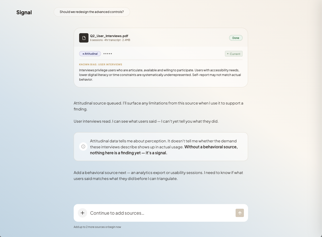
Bias Awareness
Consent isn't a setup step. It appears at the moment a source enters analysis, inline, where it's actually relevant.
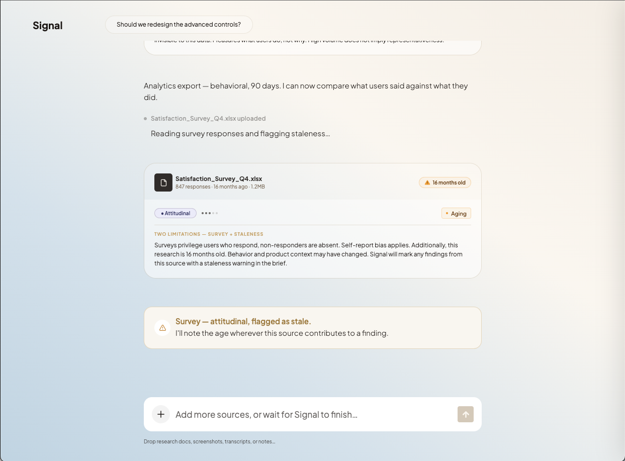
Harm Prevention
Signal surfaces temporal risk before it can shape the output.
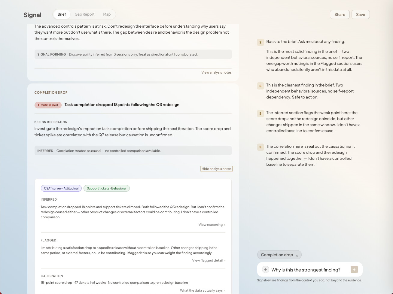
Transparency
What the system observed and what it inferred are always visually distinct.
Human Agency
The system can stop itself. When judgment is required, it interrupts its own process and returns control.
Reliability
When evidence isn't strong enough, the system says so instead of producing output anyway.
Bending the product to the instinct
I ran structured walkthroughs and put Signal in front of real designers before treating anything as solved. The failures weren't broken paths. They were moments where the designer's model of the product and the product's actual model diverged. A participant looked for export in the nav because that's where you decide how to keep something. Another corrected a finding and never saw the brief update because the edit was buried. The fix was almost never to add explanation. It was to bend the product toward the instinct the designer already had.
A research brief is only useful when the evidence can support it. When it can’t, Signal needs to show why.
Signal finds the edge of what the evidence can support and hands the rest back. The goal was never to make AI do less. It was to make sure it never quietly took ownership of a judgment that belongs to the designer. Building the synthesis was only part of the challenge. The harder part was designing the moment where the system stops and making that feel like respect for the user's judgment rather than a refusal to help.