The mission was clear. The path to act on it wasn’t.
OMG WOW · UX Design
OMG WOW is a nonprofit supporting women in personal, professional, and community development. The existing site lacked a clear membership structure, had inconsistent calls to action and reflected two competing brand directions.
I worked on restructuring the information architecture around three primary user types, introduced a simple membership model and brought the experience into a more consistent and usable system.
Duration
9 Weeks
Team
Collaborated on stakeholder interviews; led all design and prototyping independently
Tools
Figma, Miro, Google Docs
Visitors believed in the mission, but the site made it difficult to take action.
People wanted to engage, but couldn’t clearly understand what they were signing up for. Membership benefits were unclear, impact information was missing and there was no clear path from interest to action.
Trust alone wasn’t enough without clarity.
The opportunity
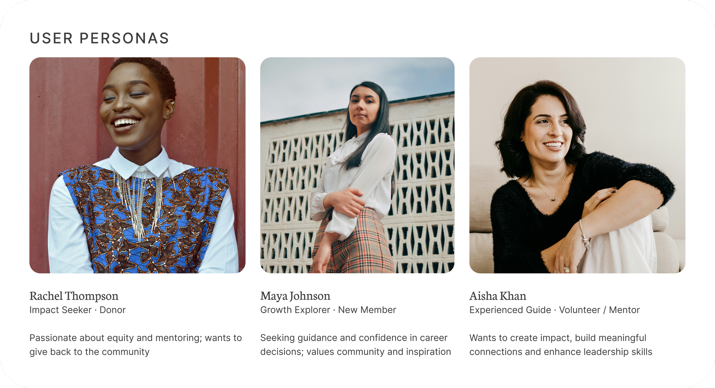
Three user types surfaced from stakeholder interviews and usability testing, each with a different decision to make.
Maya needs to understand what membership includes before joining. Rachel needs to see where her donation goes before contributing. Aisha needs confidence that her time will be used effectively before volunteering.
The redesign focused on making each of these decisions clear before users reached a point of hesitation.
Clear mission. No clear path.
The original site had no clear paths for different user types. Navigation buried the entry points. Visitors understood the mission but couldn't figure out what to do next.
Defining the structure
No user should reach a commitment moment without already understanding what their action makes possible.
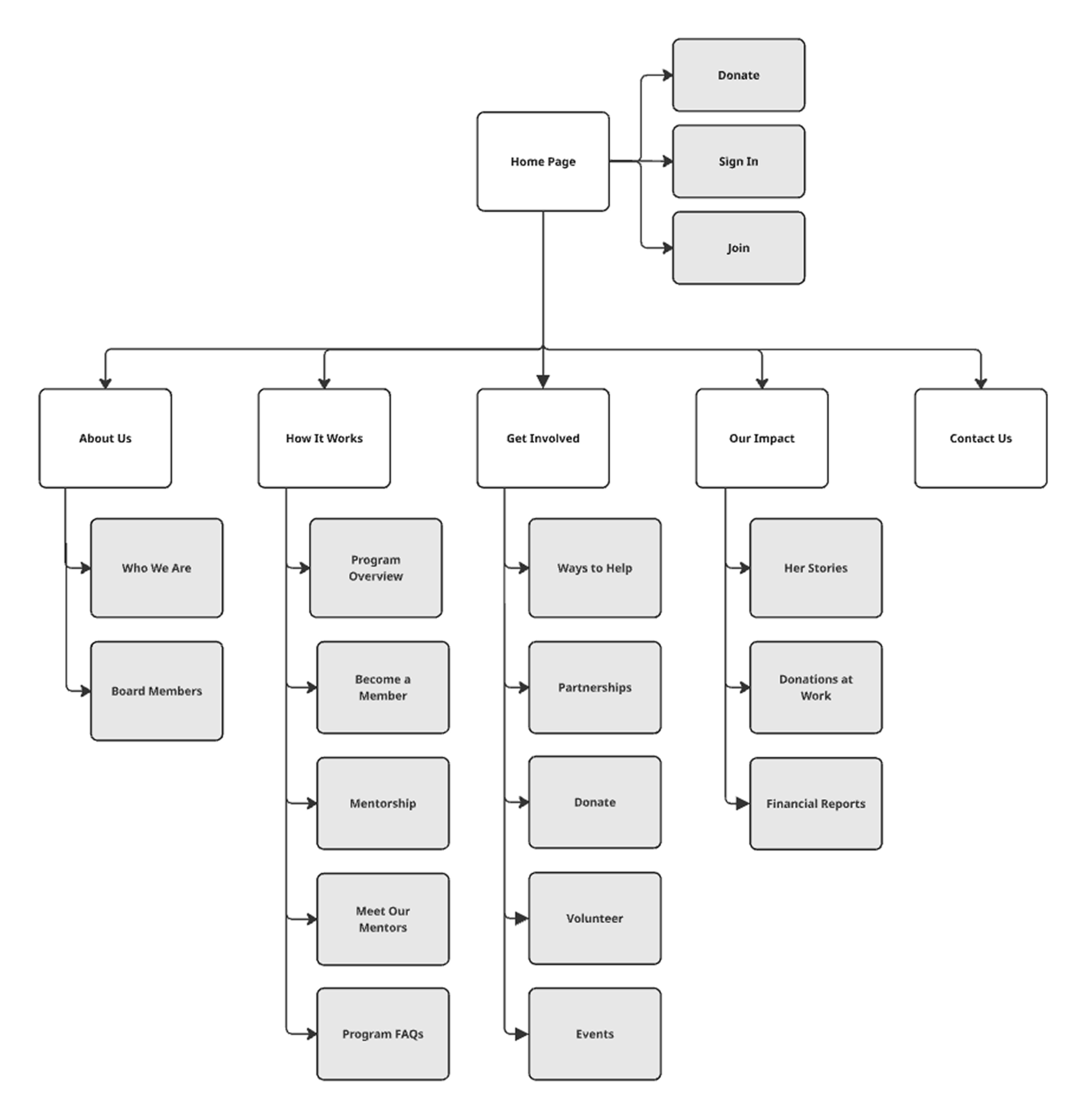
The first step was defining the information architecture. The site was structured into five clear sections with three primary actions: donate, sign in and join:
About Us
How It Works
Get Involved
Our Impact
Contact Us
Each page was mapped to a specific user need, creating direct routes through the experience instead of forcing exploration.
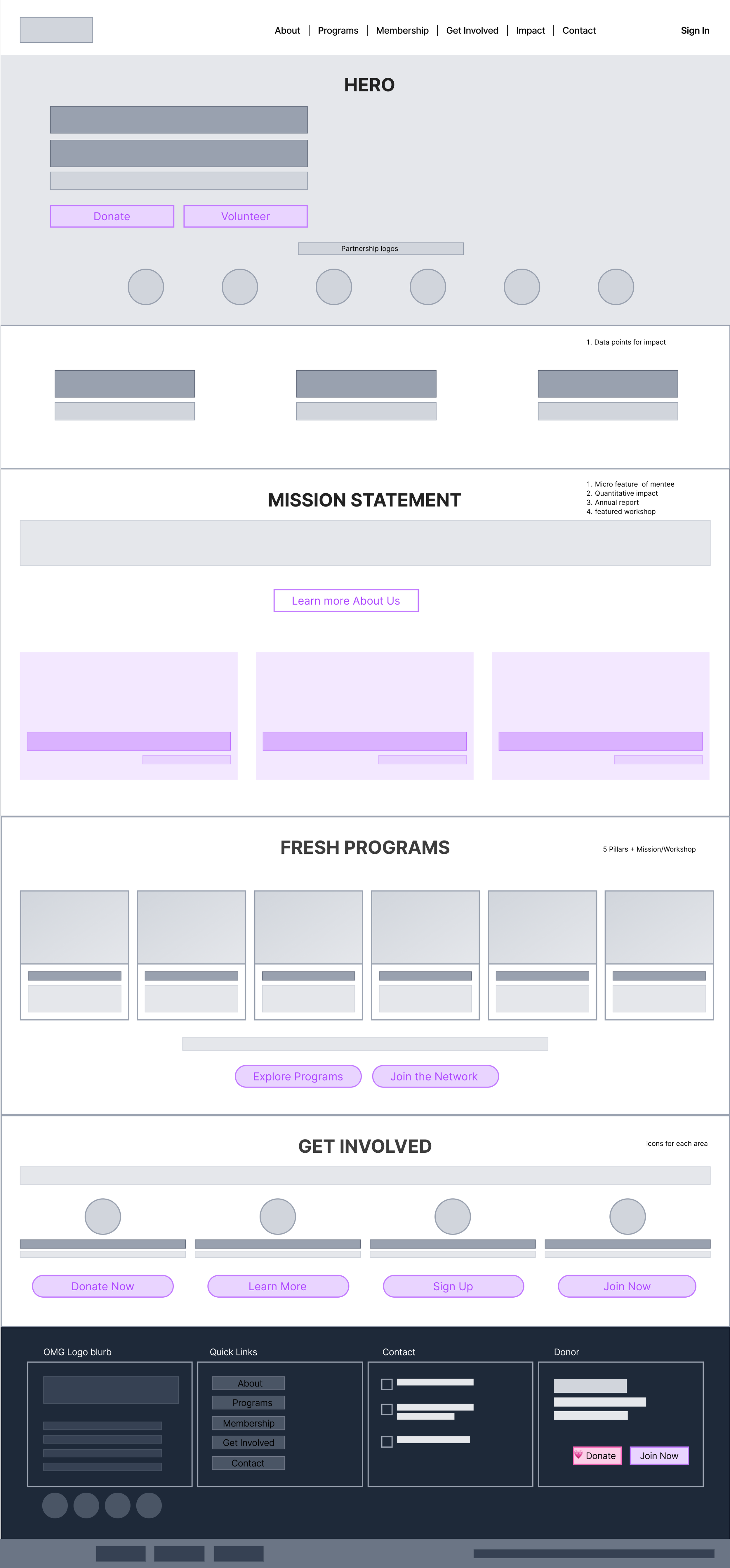
Wireframes then translated this structure into layout and hierarchy, clarifying what each user needed to see first and in what order.
From this point on, every decision was tested against the same principle: clarity must exist before commitment.
Three compounding problems. One redesign to resolve all of them.
OMG WOW had no membership structure before this project. The three tiers, Community, Level Up, and Premium, were created as part of the redesign, each mapping to a different level of commitment and need. Every section that follows addresses a specific friction point identified in research.
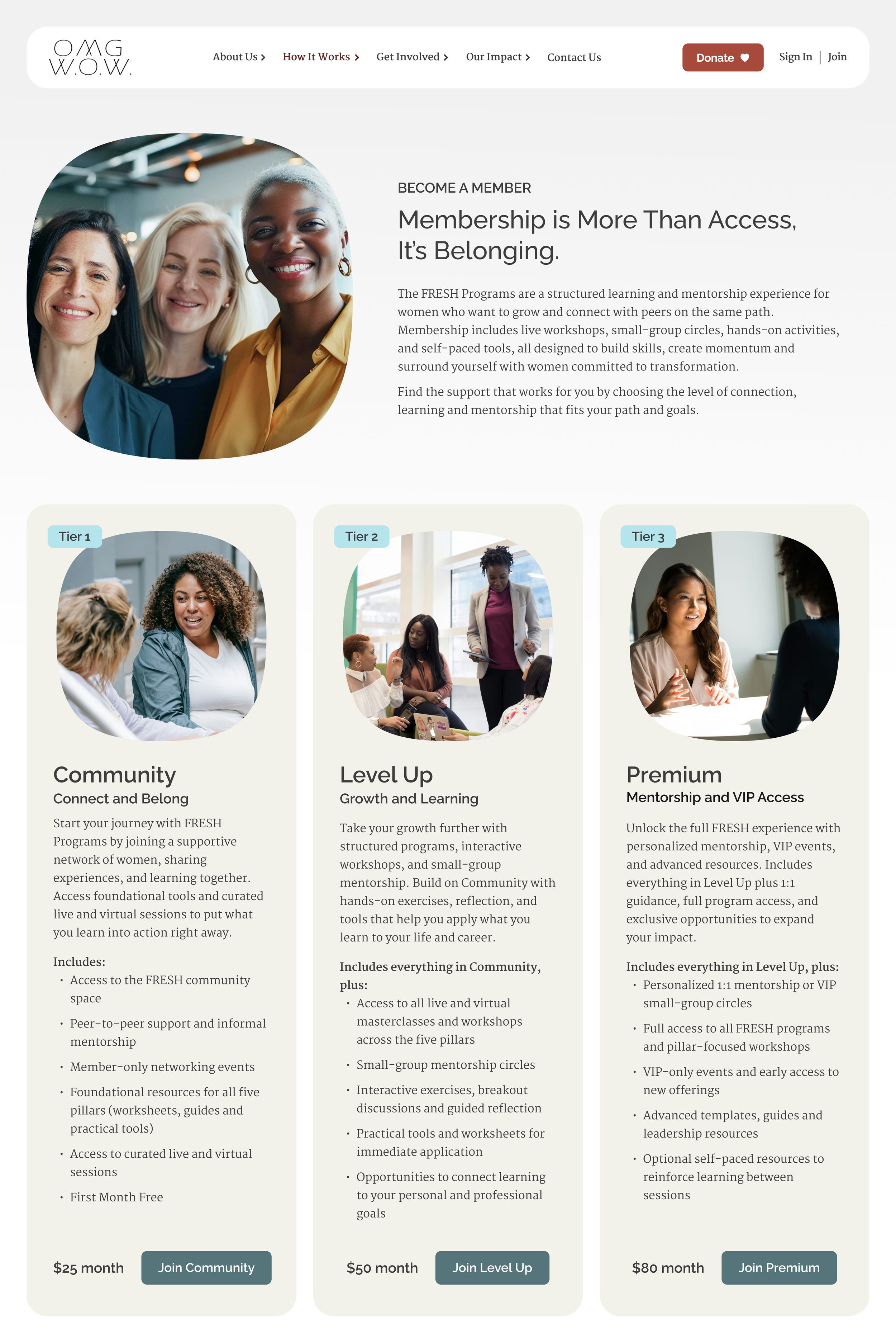
Become a Member
Problem Visitors couldn't evaluate what membership included or what it cost before committing.
Design Three transparent tiers: Community, Level Up and Premium each with clear benefits and pricing. A free trial month removes the commitment barrier and lets the organization earn trust before asking for it.
Impact Every visitor can find the tier that fits without guessing.
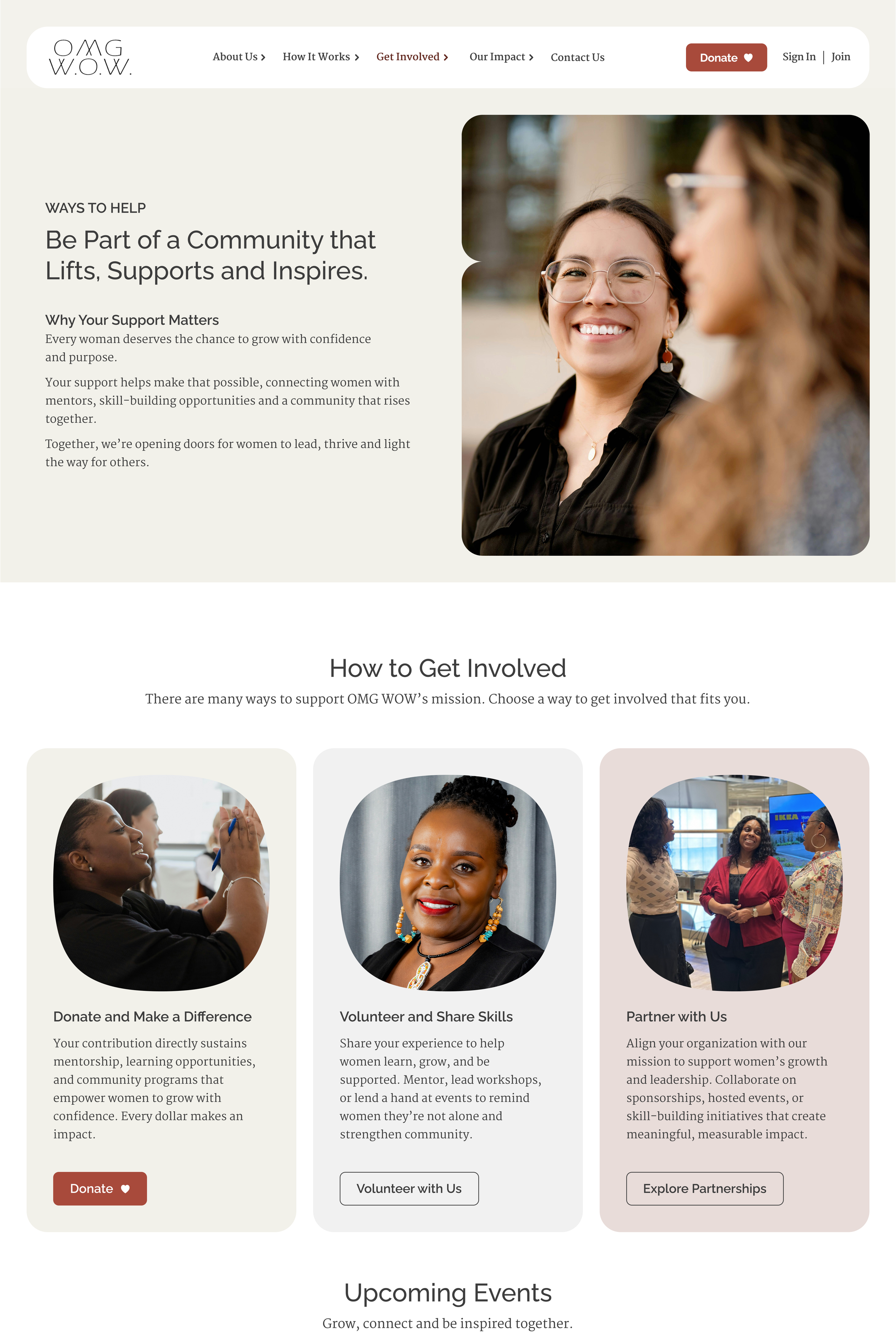
Get Involved
Problem Visitors who wanted to support OMG WOW had no clear way to understand the difference between donating, volunteering or partnering and which one was right for them.
Design One page, three distinct paths. Each explains who it's for and what it involves before asking anyone to act.
Impact Every supporter type has a direct route to the right action.
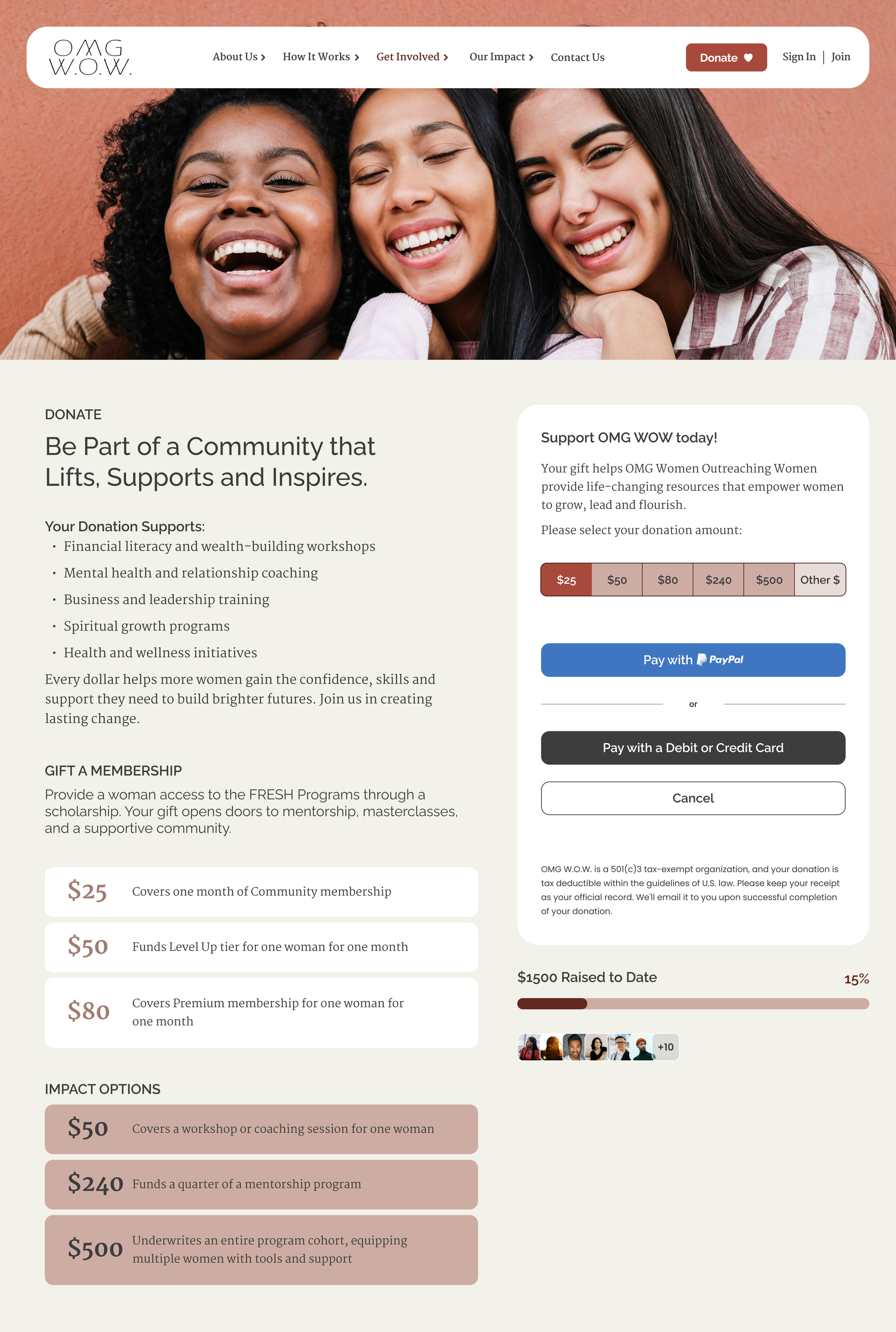
Donate
Problem The existing donate button felt transactional and untrustworthy. Visitors had no way to see where their money went or what it actually made possible.
Design Each giving amount is tied to a specific outcome. $25 covers one month of community membership, $50 funds Level Up for one woman, $80 covers Premium. Modeled on established nonprofit patterns donors already trust.
Impact Individual donors and corporate partners both see what their contribution makes possible before they give.
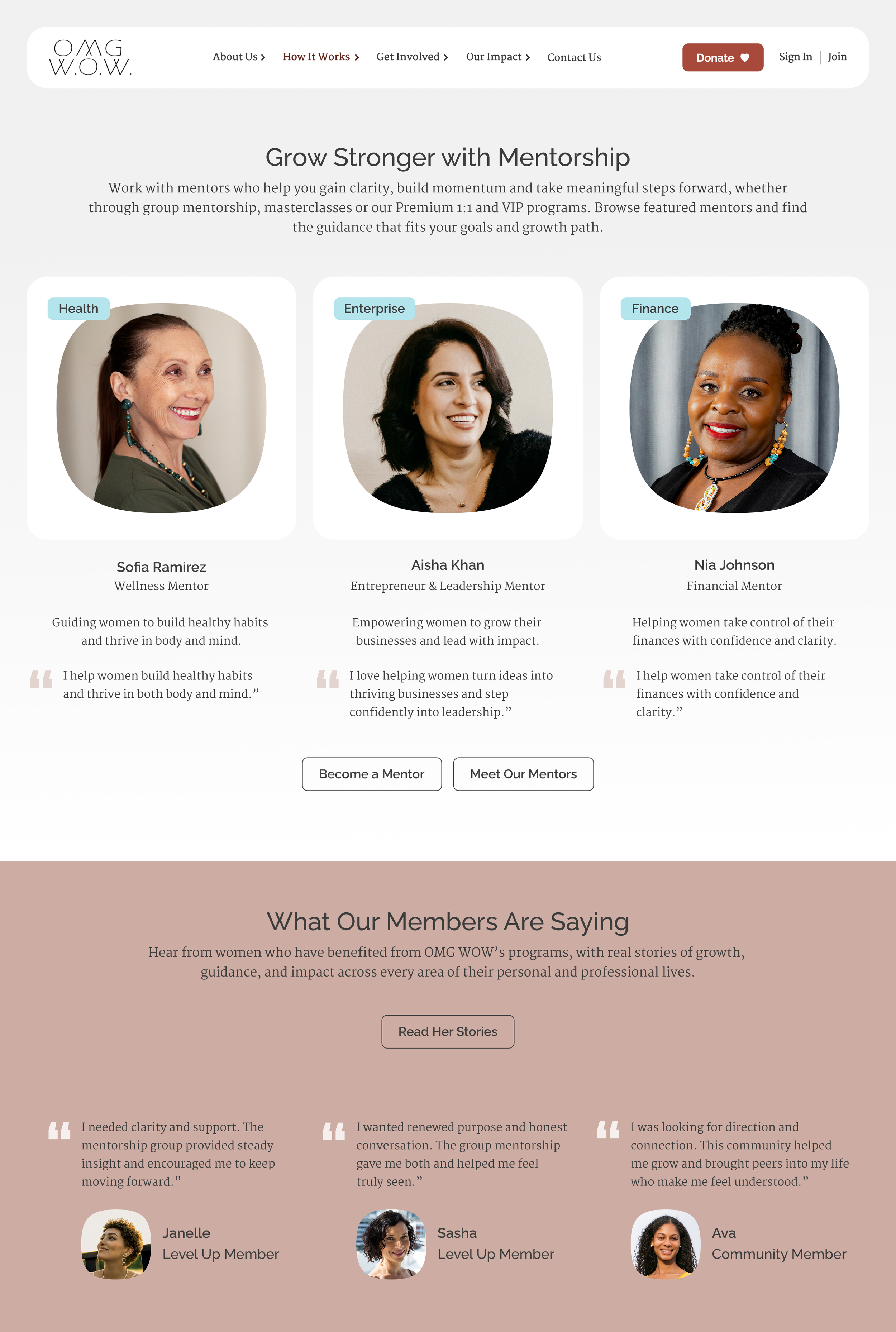
Mentorship
Problem Visitors had no way to evaluate the mentorship program before committing. No proof it worked, no sense of what they'd actually get.
Design Program benefits, real outcomes and mentor stories on one page. Social proof does the work of building trust before anyone has to ask.
Impact Visitors can see the value of mentorship before they sign up for it.
What the redesign resolved.
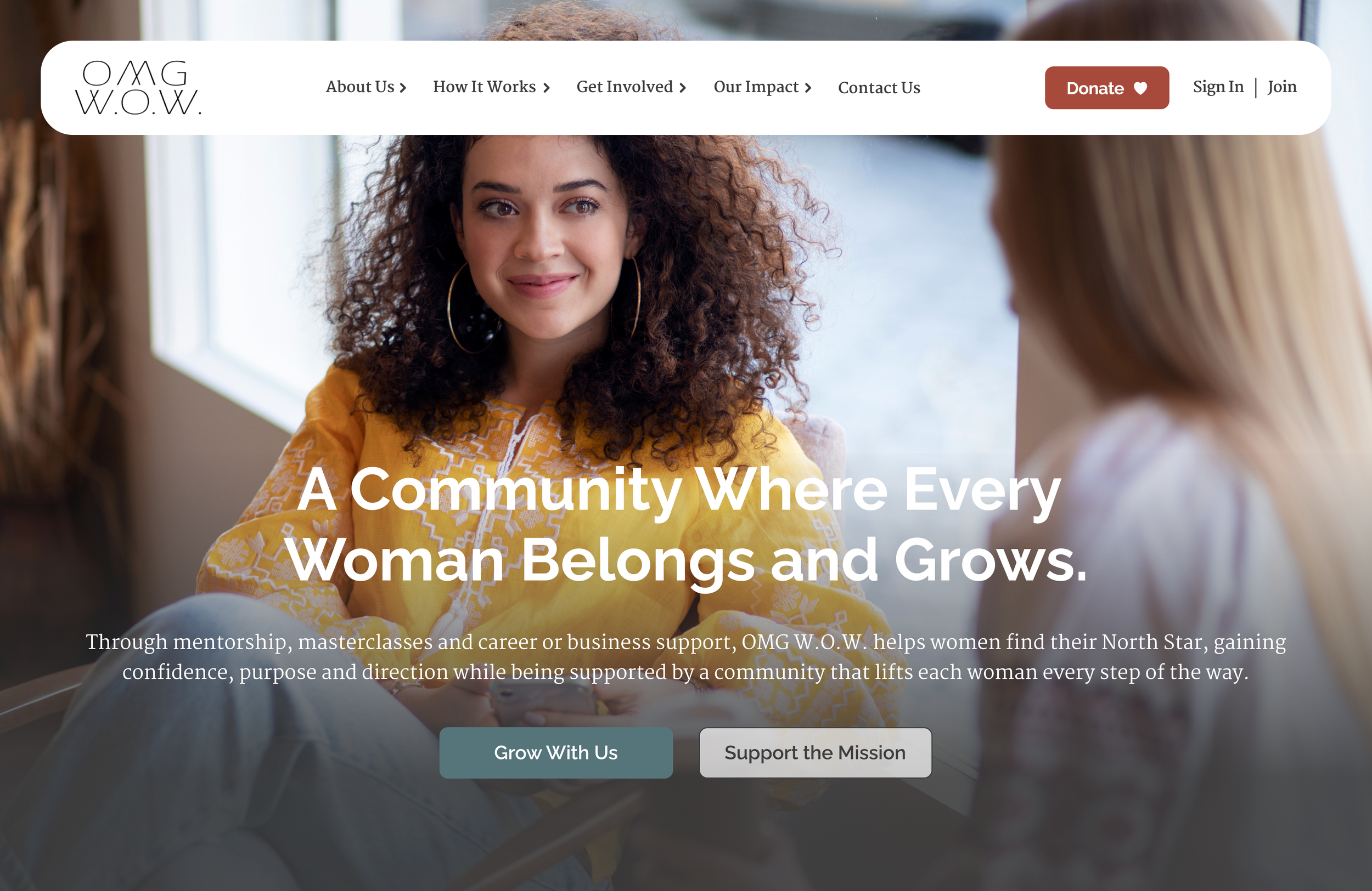
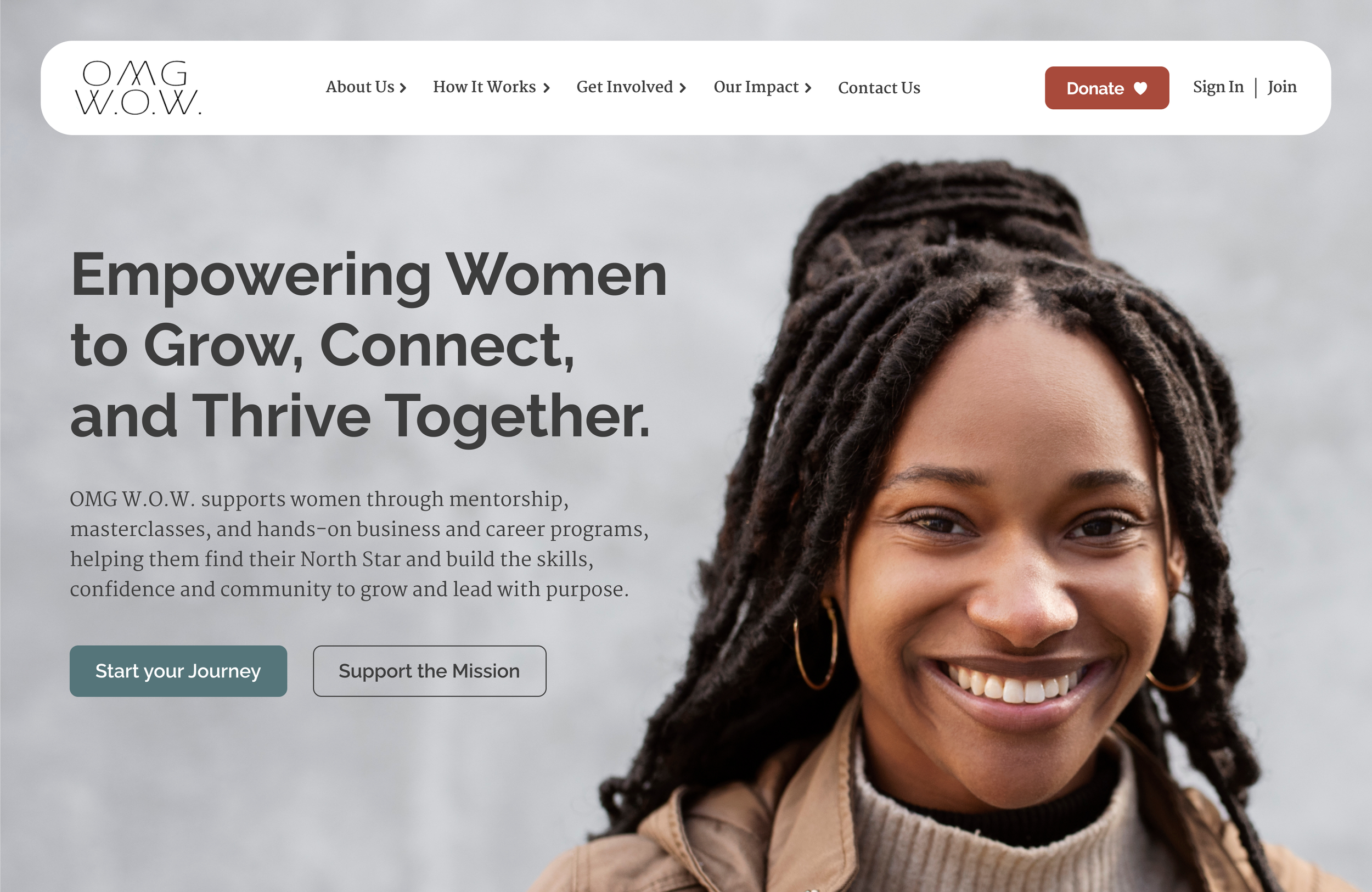
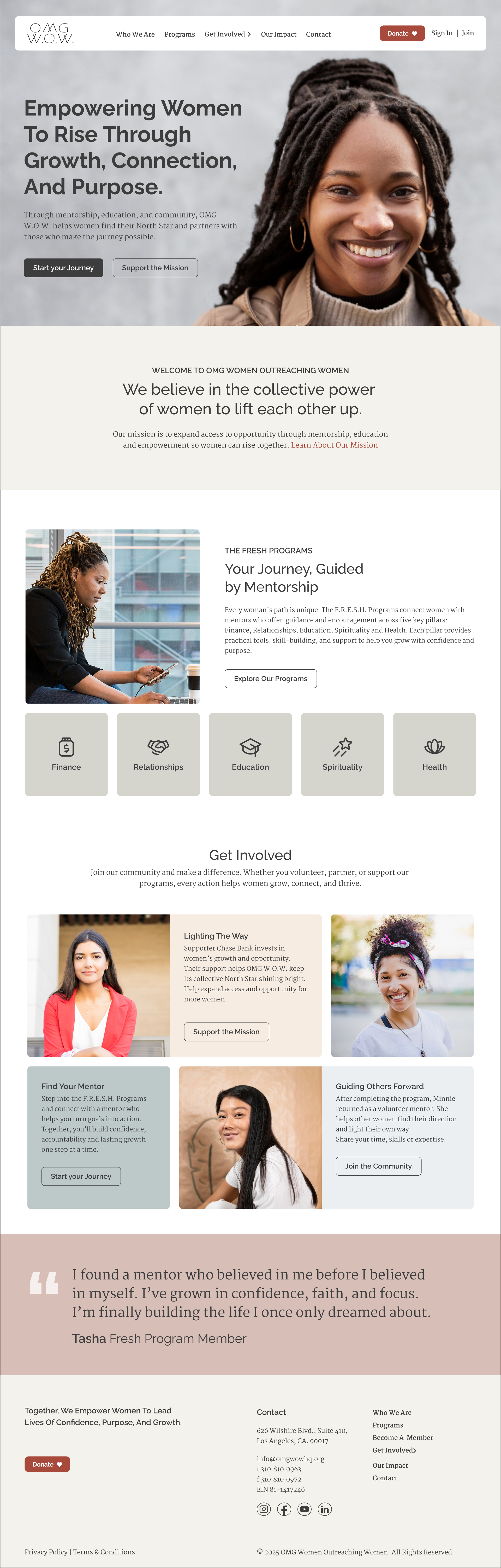
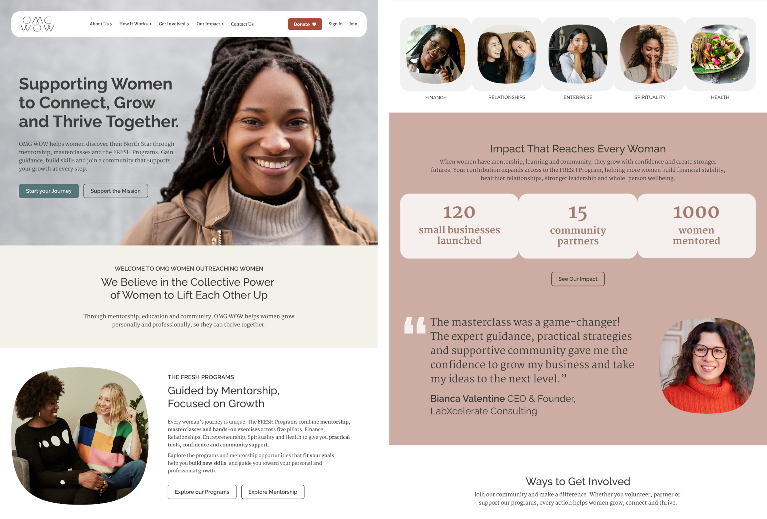
Homepage Survey Before finalizing the homepage, I tested two image directions with real users. The question wasn't which looked better. It was whether women felt represented and welcome before reading a single word. The warm, authentic direction won clearly. Rotating images of women of all ages and backgrounds created immediate recognition. That response defined the final image selection criteria.
Stakeholder Presentation Findings and design recommendations presented directly to OMG WOW stakeholders. The redesign addressed three compounding problems: two separate platform identities undermining trust, inconsistent CTAs leaving visitors without a clear path, and a visual language that didn't signal credibility.
The biggest shift Unifying OMG WOW and FRESH into a single identity resolved the trust gap. Visitors weren't converting because the experience didn't feel like an organization that had its act together. By making impact visible with real progress and tangible results, donors and members have a reason to stay engaged after that first visit.